CHRIS HUITT
projectpath ai · ux/ui design CO-OP · 0→1 product design · ~4 months
A 12-stage project management methodology dissolved into daily work that keeps teams on process and off training
context
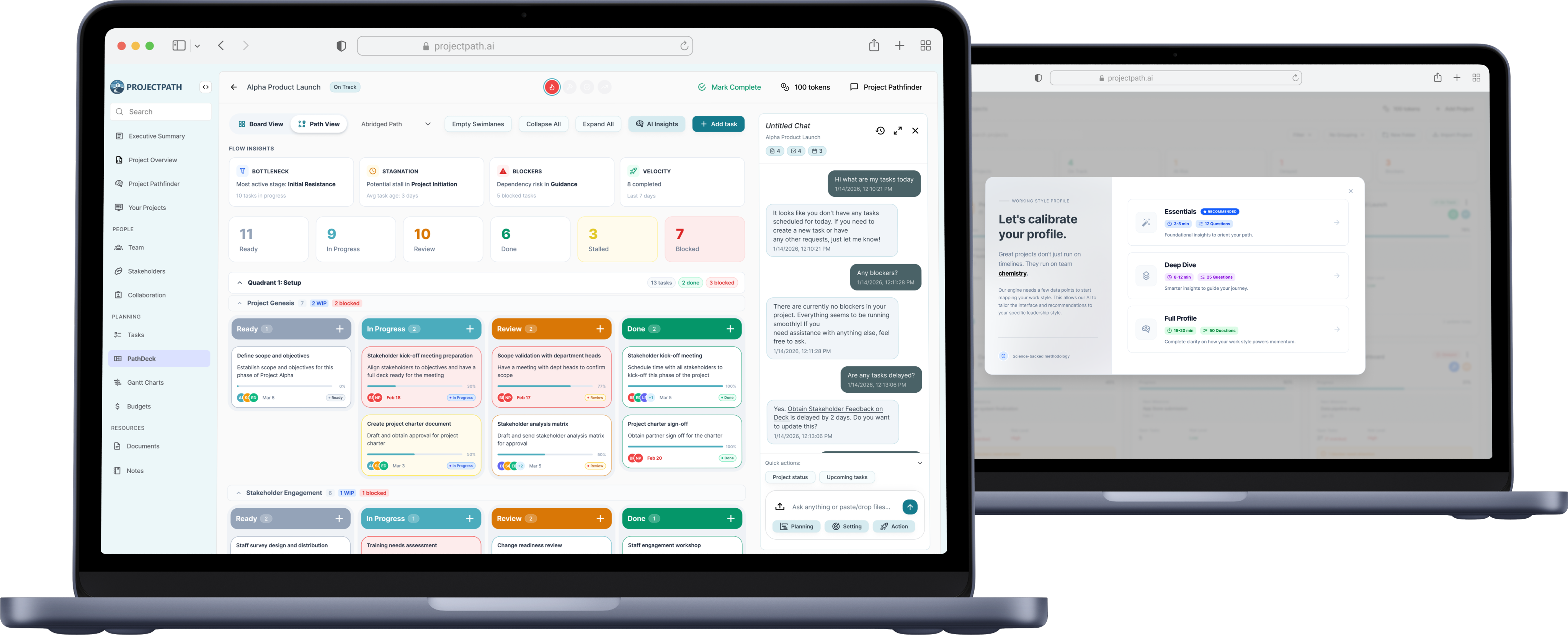
An AI-powered project management dashboard whose methodology was also its steepest barrier to entry.
I designed the product 0→1, from information architecture and a design system to every core screen, concentrating on the three features that carry the differentiator: PathDeck, Pathfinder (the AI agent), and the Working Style Profile. Working alongside one developer and the founders with no research budget, I grounded each decision in usability heuristics and lightweight testing, designing to make a genuinely complex methodology usable, not just visible.
the problem
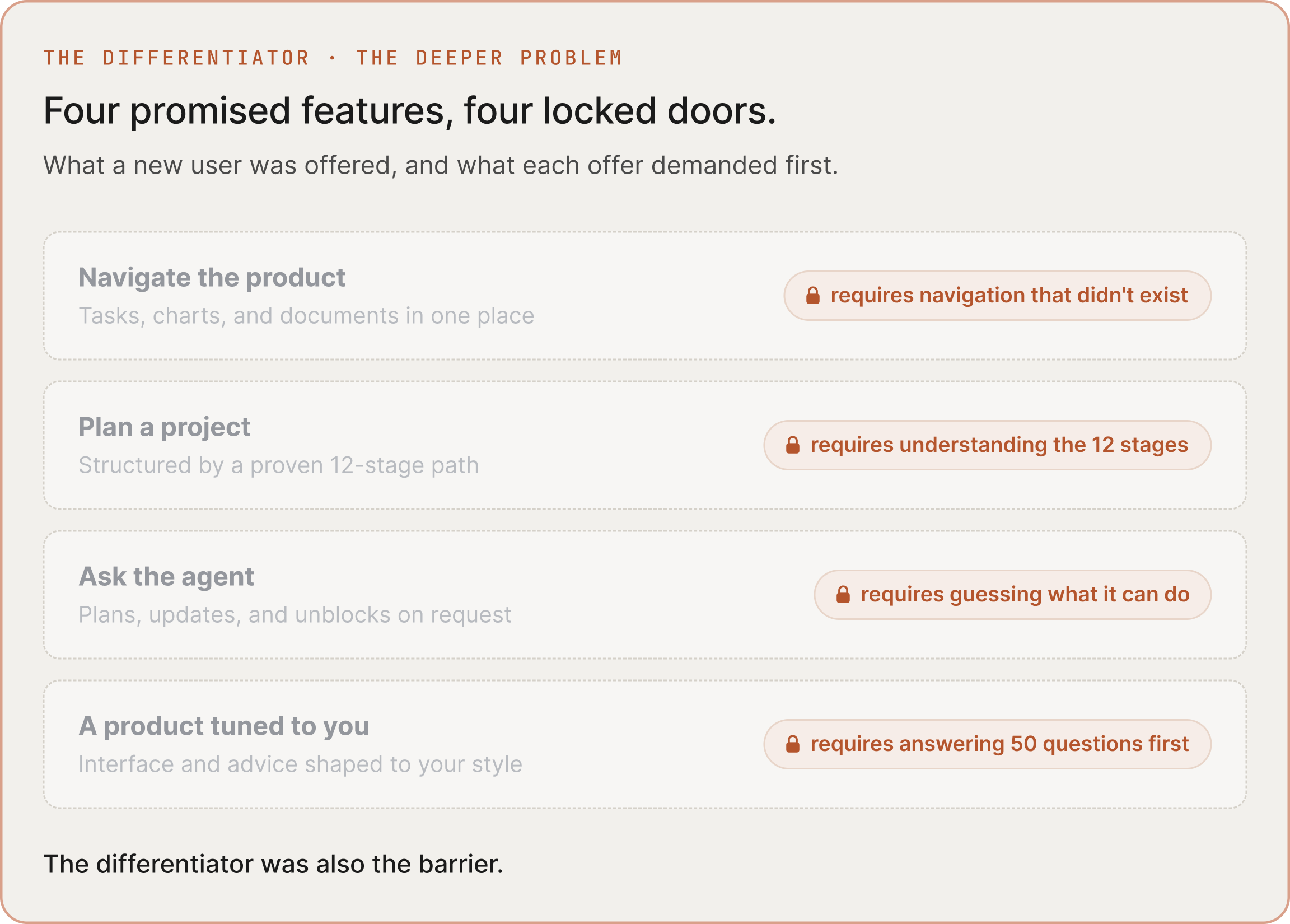
ProjectPath could run your projects for you. None of it was usable until you'd learned a 12-stage methodology.
I inherited an AI-generated prototype that read as a concept dump, not a product: dense pages, no hierarchy, near-absent navigation, no design system. The deeper problem was the differentiator itself. The methodology demanded comprehension before delivering any value.
I realized:
This wasn't a simplification problem, it was a legibility one. Users needed confidence in a complex system before they'd mastered it.
That raised one question:
How might we deliver the methodology's value and let users work before they’re willing to study it?
the user’s needs
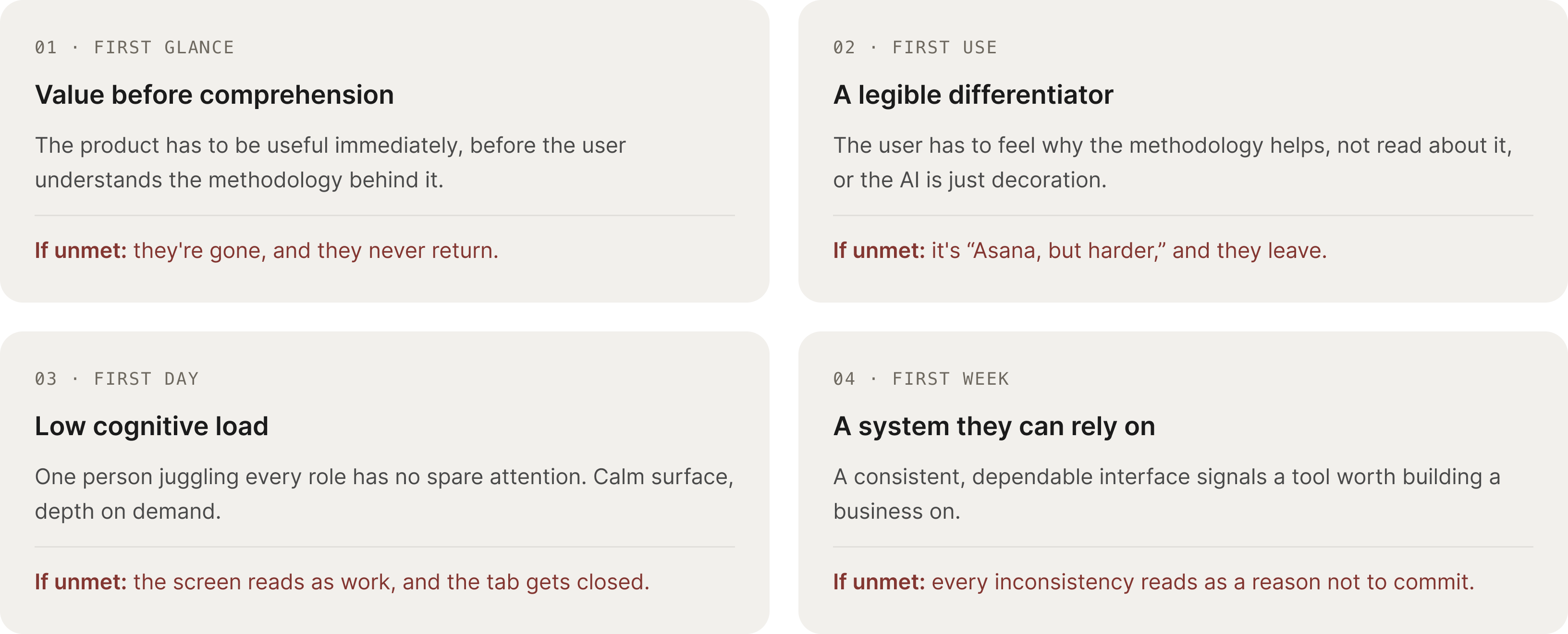
The user had no time to learn a tool and no one to delegate it to.
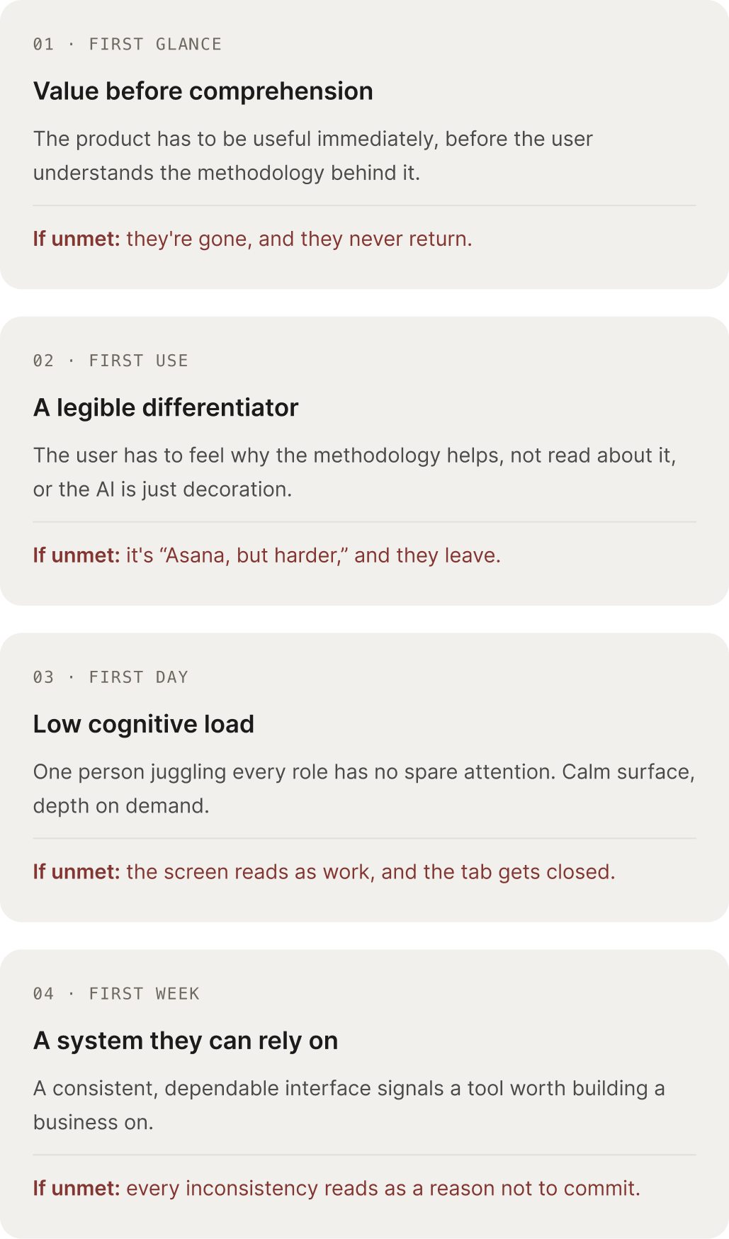
ProjectPath's users are solo entrepreneurs and lean teams: no time, no project manager, no margin for a learning curve. A tool that demands study before delivering value is a reason to quit. I grounded four requirements in the founders' interviews and competitive analysis.
navigation
A product that does this much should still feel like one room, not twenty.
The inherited AI-generated prototype scattered twenty-plus surfaces across two systems, with the depth hidden in dropdowns. I designed one grouped, contextual sidebar so the whole product reads as a few predictable zones, not a maze.
Rapid iterative wireframing with ai
AI made exploring cheap. Deciding stayed expensive.
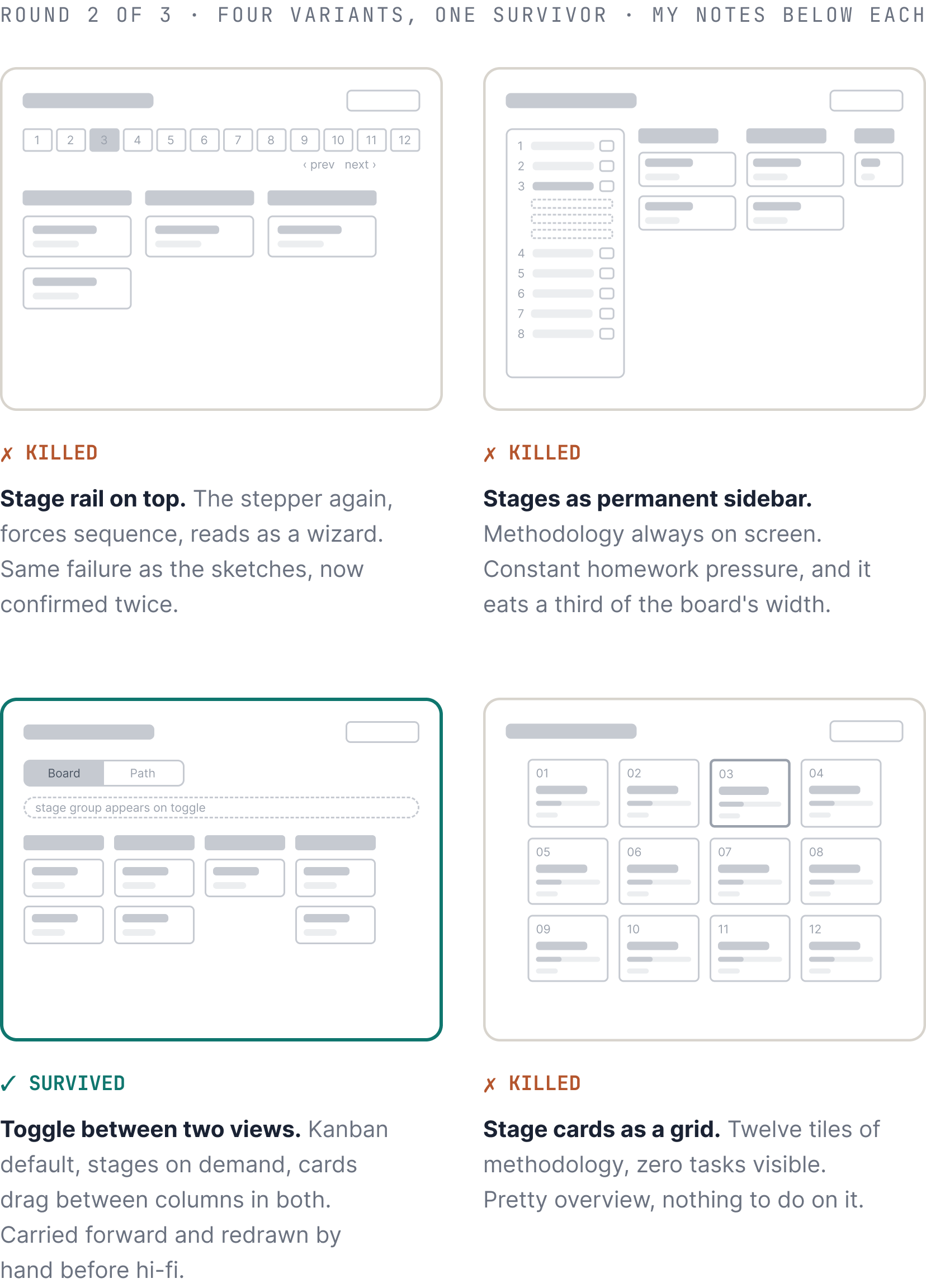
The inherited prototype showed what AI produces without direction. I used the same tools with a tight brief, hard constraints, and a fast reject loop. Deciding what died took the same judgment sketching does. Three rounds got PathDeck from open question to testable structure.
What each round cost
A round of four variants took little time to generate and an afternoon to judge, against days to draw the same spread by hand. The saved time went where AI can't follow, into testing the survivor's toggle with real users.
What never touched AI
The reject reasons, the hand redraw of the survivor, and every hi-fi decision after it. Generation widened the funnel; everything that narrowed it was manual.
design system
One designer, 18+ surfaces, four months. The design system is how that math worked.
I built the system alongside the first screens, not before them, so every token earned its place by being needed twice. Colors are named for meaning, not hue, and state is never carried by color alone. The payoff was speed with consistency: later screens were assembly, not invention.
The PathDeck task card, read four ways: the densest single component in the system.
solutions
Three features turn using the product into learning the methodology
What follows are those three features: PathDeck, Pathfinder, and the Working Style Profile, each shown as the decision that shaped it, not a tour of screens.
01
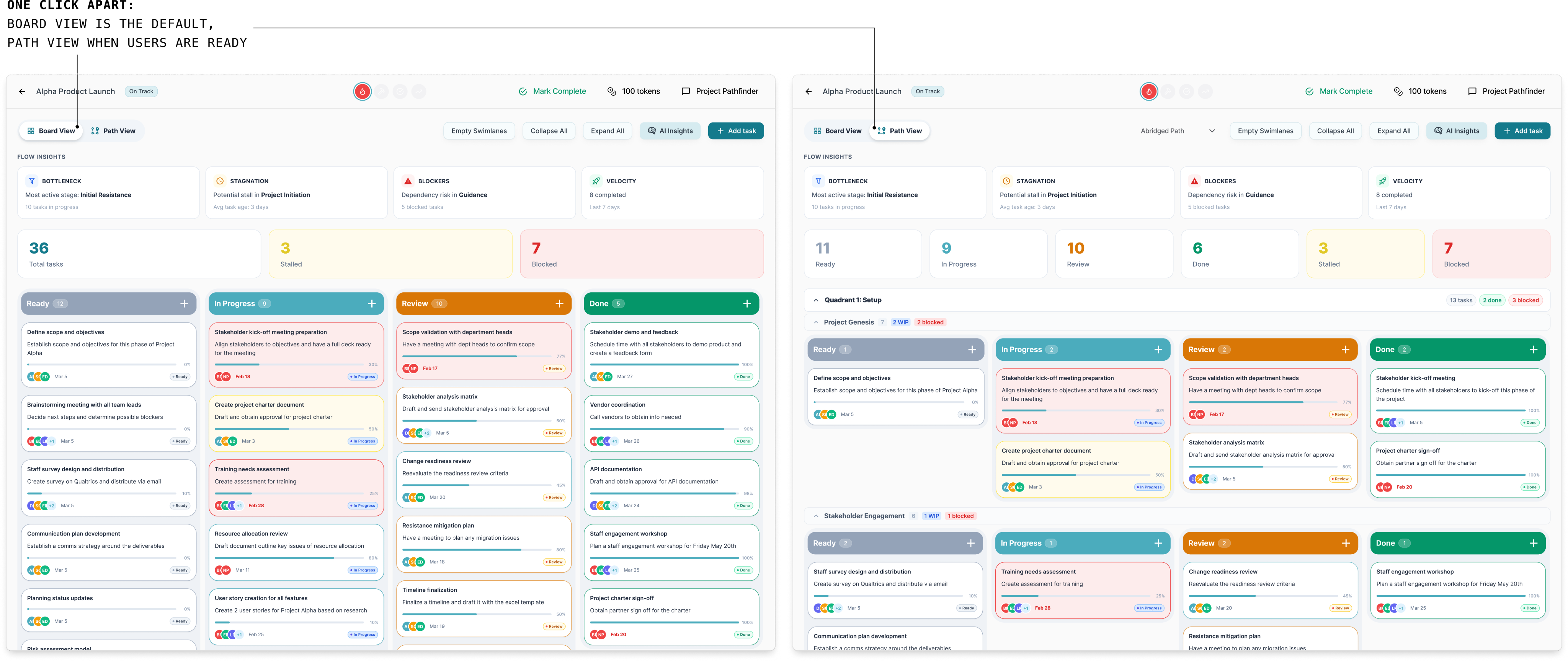
A task board that teaches the methodology by looking familiar
A solo founder plans their first project in minutes because Board View is the kanban they already know. When they're ready, Path View maps those same tasks onto the 12 stages, so the methodology arrives by recognition, not study.
03
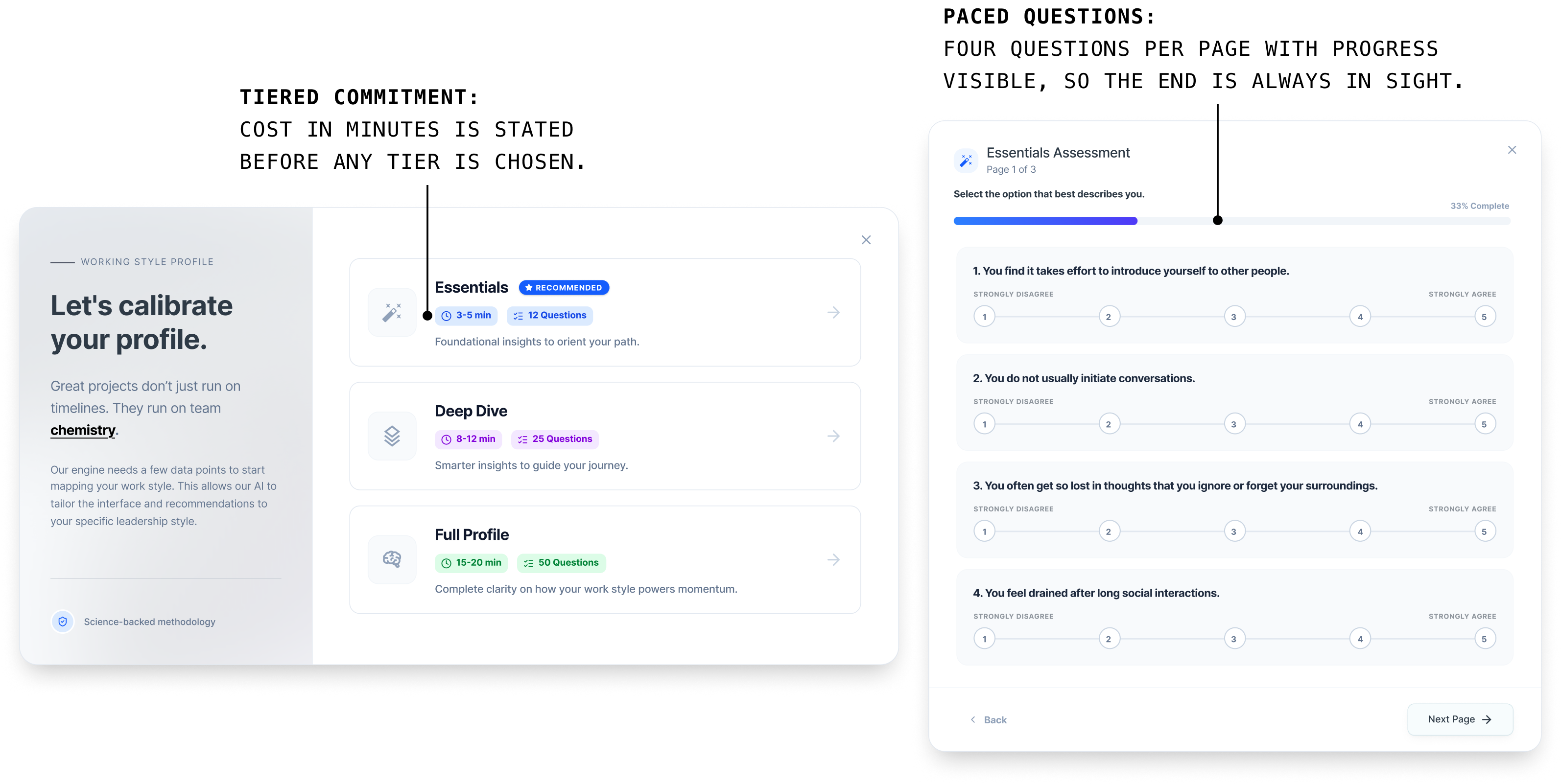
Onboarding assessment resized to match user patience
Users abandoned an assessment that asked 50 questions before giving anything back, so I rebuilt it into three tiers that reversed the trade. Five minutes earns a tuned product and going deeper sharpens it. Depth is offered, never required.
02
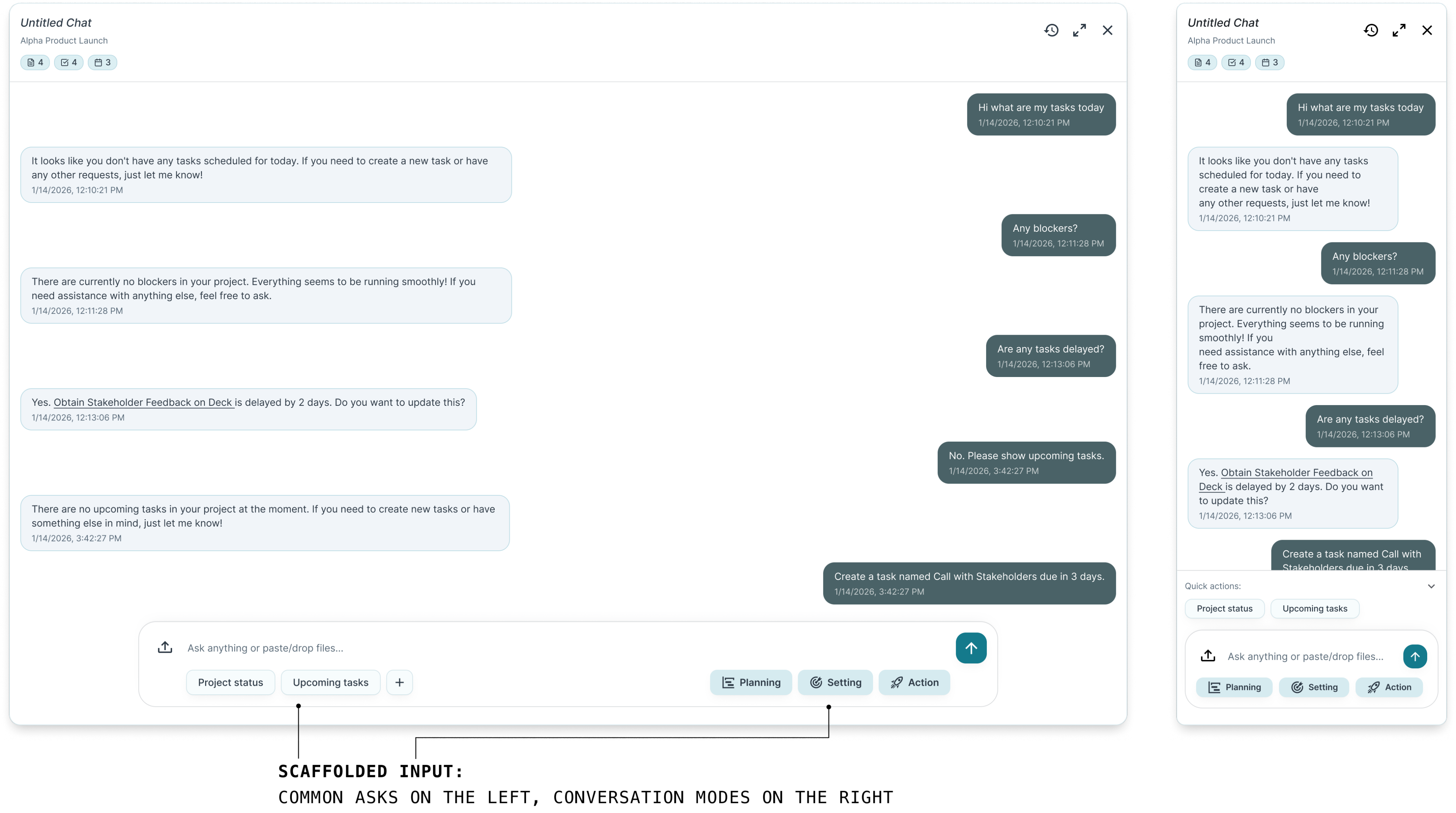
Pathfinder (AI agent) interface designed for mid-task help, not just conversations
An empty chat box stalls people, so Quick Actions and modes give every session somewhere to start. It docks beside the work for quick checks, expands full-screen for planning, and users write normally while the agent handles the methodology.
outcome
Most of the product was in code by the time my co-op ended
I handed off all 18+ surfaces and the design system to the team's developer, then stayed in the build loop, revising designs as implementation raised new questions. By April 2026, the core product, including PathDeck, Pathfinder, and the assessment, was largely built.
reflection
The framework was fixed. Nothing else was.
I couldn't change the framework, only how it met people. That constraint sharpened every decision: sequence, defaults, language, timing. I learned that most of design's power sits in the layer between a system and its users.
A second opinion you build isn't the same as one you find
Founders and our dev provided their feedback, but nobody could critique the craft. So I built my own checks: testing copy on outsiders, rereading flows cold a day later. In hindsight, I'd have found outside design critique early, a mentor, instead of only simulating one.
Good taste starts with someone else's draft
I inherited a rough AI-generated prototype and my instinct was to scrap it. Instead it became my cheapest research tool: it showed me what the founders thought they were building. Bad drafts are data. I stopped needing to start from zero to do original work.
The methodology of ProjectPath AI was created by Kevin Vaughn.
For more information about ProjectPath AI, please contact Kevin at kevin.vaughn@gmail.com.
projectpath ai · ux/ui design CO-OP · 0→1 product design · ~4 months
A 12-stage project management methodology dissolved into daily work that keeps teams on process and off training
context
An AI-powered project management dashboard whose methodology was also its steepest barrier to entry.
I designed the product 0→1, from information architecture and a design system to every core screen, concentrating on the three features that carry the differentiator: PathDeck, Pathfinder (the AI agent), and the Working Style Profile. Working alongside one developer and the founders with no research budget, I grounded each decision in usability heuristics and lightweight testing, designing to make a genuinely complex methodology usable, not just visible.
the problem
ProjectPath could run your projects for you. None of it was usable until you'd learned a 12-stage methodology.
I inherited an AI-generated prototype that read as a concept dump, not a product: dense pages, no hierarchy, near-absent navigation, no design system. The deeper problem was the differentiator itself. The methodology demanded comprehension before delivering any value.
I realized:
This wasn't a simplification problem, it was a legibility one. Users needed confidence in a complex system before they'd mastered it.
That raised one question:
How might we deliver the methodology's value and let users work before they’re willing to study it?
the user’s needs
The user had no time to learn a tool and no one to delegate it to.
ProjectPath's users are solo entrepreneurs and lean teams: no time, no project manager, no margin for a learning curve. A tool that demands study before delivering value is a reason to quit. I grounded four requirements in the founders' interviews and competitive analysis.
navigation
A product that does this much should still feel like one room, not twenty.
The inherited AI-generated prototype scattered twenty-plus surfaces across two systems, with the depth hidden in dropdowns. I designed one grouped, contextual sidebar so the whole product reads as a few predictable zones, not a maze.
Rapid iterative wireframing with ai
AI made exploring cheap. Deciding stayed expensive.
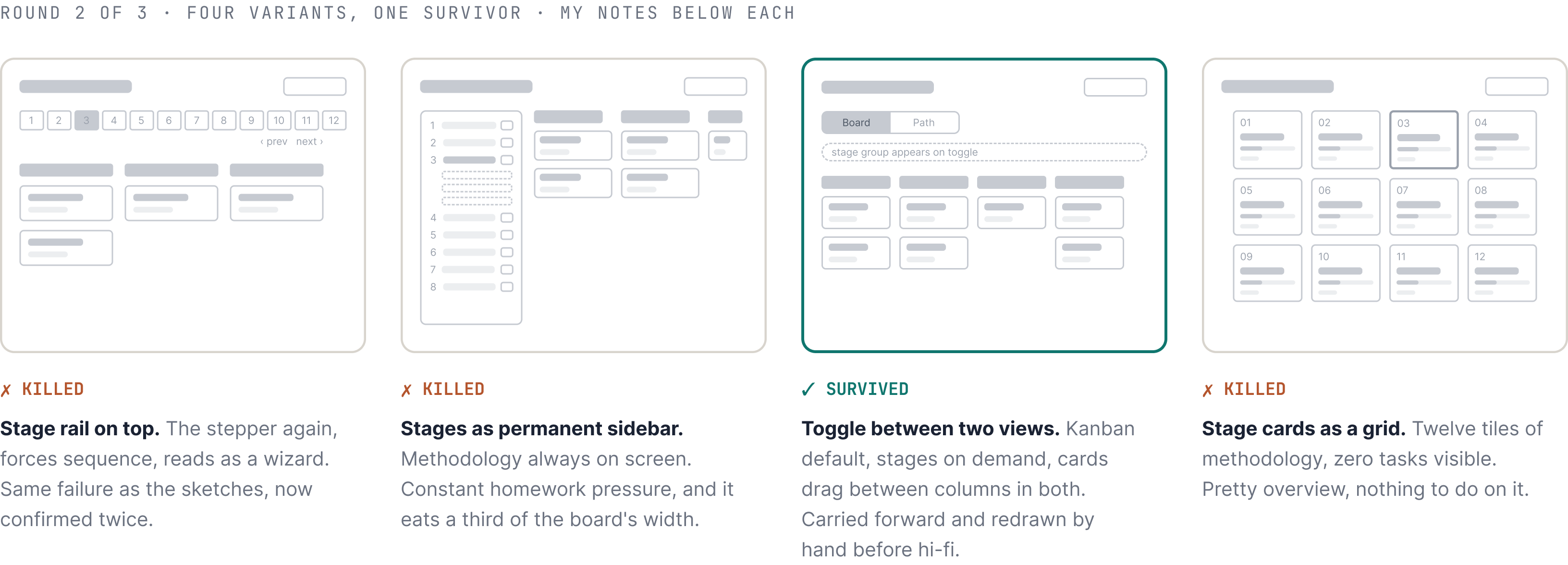
The inherited prototype showed what AI produces without direction. I used the same tools with a tight brief, hard constraints, and a fast reject loop. Deciding what died took the same judgment sketching does. Three rounds got PathDeck from open question to testable structure.
What each round cost
A round of four variants took little time to generate and an afternoon to judge, against days to draw the same spread by hand. The saved time went where AI can't follow, into testing the survivor's toggle with real users.
What never touched AI
The reject reasons, the hand redraw of the survivor, and every hi-fi decision after it. Generation widened the funnel; everything that narrowed it was manual.
design system
One designer, 18+ surfaces, four months. The design system is how that math worked.
I built the system alongside the first screens, not before them, so every token earned its place by being needed twice. Colors are named for meaning, not hue, and state is never carried by color alone. The payoff was speed with consistency: later screens were assembly, not invention.
The PathDeck task card, read four ways: the densest single component in the system.
solutions
Three features turn using the product into learning the methodology
What follows are those three features: PathDeck, Pathfinder, and the Working Style Profile, each shown as the decision that shaped it, not a tour of screens.
01
A task board that teaches the methodology by looking familiar
A solo founder plans their first project in minutes because Board View is the kanban they already know. When they're ready, Path View maps those same tasks onto the 12 stages, so the methodology arrives by recognition, not study.
02
Pathfinder (AI agent) interface designed for mid-task help, not just conversations
An empty chat box stalls people, so Quick Actions and modes give every session somewhere to start. It docks beside the work for quick checks, expands full-screen for planning, and users write normally while the agent handles the methodology.
03
Onboarding assessment resized to match user patience
Users abandoned an assessment that asked 50 questions before giving anything back, so I rebuilt it into three tiers that reversed the trade. Five minutes earns a tuned product and going deeper sharpens it. Depth is offered, never required.
outcome
Most of the product was in code by the time my co-op ended
I handed off all 18+ surfaces and the design system to the team's developer, then stayed in the build loop, revising designs as implementation raised new questions. By April 2026, the core product, including PathDeck, Pathfinder, and the assessment, was largely built.
reflection
The framework was fixed. Nothing else was.
I couldn't change the framework, only how it met people. That constraint sharpened every decision: sequence, defaults, language, timing. I learned that most of design's power sits in the layer between a system and its users.
A second opinion you build isn't the same as one you find
Founders and our dev provided their feedback, but nobody could critique the craft. So I built my own checks: testing copy on outsiders, rereading flows cold a day later. In hindsight, I'd have found outside design critique early, a mentor, instead of only simulating one.
Good taste starts with someone else's draft
I inherited a rough AI-generated prototype and my instinct was to scrap it. Instead it became my cheapest research tool: it showed me what the founders thought they were building. Bad drafts are data. I stopped needing to start from zero to do original work.
The methodology of ProjectPath AI was created by Kevin Vaughn.
For more information about ProjectPath AI, please contact Kevin at kevin.vaughn@gmail.com.
projectpath ai · ux/ui design CO-OP · 0→1 product design · ~4 months
A 12-stage project management methodology dissolved into daily work that keeps teams on process and off training
context
An AI-powered project management dashboard whose methodology was also its steepest barrier to entry.
I designed the product 0→1, from information architecture and a design system to every core screen, concentrating on the three features that carry the differentiator: PathDeck, Pathfinder (the AI agent), and the Working Style Profile. Working alongside one developer and the founders with no research budget, I grounded each decision in usability heuristics and lightweight testing, designing to make a genuinely complex methodology usable, not just visible.
the problem
ProjectPath could run your projects for you. None of it was usable until you'd learned a 12-stage methodology.
I inherited an AI-generated prototype that read as a concept dump, not a product: dense pages, no hierarchy, near-absent navigation, no design system. The deeper problem was the differentiator itself. The methodology demanded comprehension before delivering any value.
I realized:
This wasn't a simplification problem, it was a legibility one. Users needed confidence in a complex system before they'd mastered it.
That raised one question:
How might we deliver the methodology's value and let users work before they’re willing to study it?
the user’s needs
The user had no time to learn a tool and no one to delegate it to.
ProjectPath's users are solo entrepreneurs and lean teams: no time, no project manager, no margin for a learning curve. A tool that demands study before delivering value is a reason to quit. I grounded four requirements in the founders' interviews and competitive analysis.
navigation
A product that does this much should still feel like one room, not twenty.
The inherited AI-generated prototype scattered eighteen-plus surfaces across two systems, with the core tools buried in dropdowns. I designed one grouped, contextual sidebar so the whole product reads as a few predictable rooms, not a maze.
Rapid iterative wireframing with ai
AI made exploring cheap. Deciding stayed expensive.
The inherited prototype showed what AI produces without direction. I used the same tools with a tight brief, hard constraints, and a fast reject loop. Deciding what died took the same judgment sketching does. Three rounds got PathDeck from open question to testable structure.
What each round cost
A round of four variants took little time to generate and an afternoon to judge, against days to draw the same spread by hand. The saved time went where AI can't follow, into testing the survivor's toggle with real users.
What never touched AI
The reject reasons, the hand redraw of the survivor, and every hi-fi decision after it. Generation widened the funnel; everything that narrowed it was manual.
design system
One designer, 18+ surfaces, four months. The design system is how that math worked.
I built the system alongside the first screens, not before them, so every token earned its place by being needed twice. Colors are named for meaning, not hue, and state is never carried by color alone. The payoff was speed with consistency: later screens were assembly, not invention.
The PathDeck task card, read four ways: the densest single component in the system.
solutions
Three features turn using the product into learning the methodology
What follows are those three features: PathDeck, Pathfinder, and the Working Style Profile, each shown as the decision that shaped it, not a tour of screens.
01
A task board that teaches the methodology by looking familiar
A solo founder plans their first project in minutes because Board View is the kanban they already know. When they're ready, Path View maps those same tasks onto the 12 stages, so the methodology arrives by recognition, not study.
02
Pathfinder (AI agent) interface designed for mid-task help, not just conversations
An empty chat box stalls people, so Quick Actions and modes give every session somewhere to start. It docks beside the work for quick checks, expands full-screen for planning, and users write normally while the agent handles the methodology.
03
Onboarding assessment resized to match user patience
Users abandoned an assessment that asked 50 questions before giving anything back, so I rebuilt it into three tiers that reversed the trade. Five minutes earns a tuned product and going deeper sharpens it. Depth is offered, never required.
outcome
Most of the product was in code by the time my co-op ended
I handed off all 18+ surfaces and the design system to the team's developer, then stayed in the build loop, revising designs as implementation raised new questions. By April 2026, the core product, including PathDeck, Pathfinder, and the assessment, was largely built.
reflection
The framework was fixed. Nothing else was.
I couldn't change the framework, only how it met people. That constraint sharpened every decision: sequence, defaults, language, timing. I learned that most of design's power sits in the layer between a system and its users.
A second opinion you build isn't the same as one you find
Founders and our dev provided their feedback, but nobody could critique the craft. So I built my own checks: testing copy on outsiders, rereading flows cold a day later. In hindsight, I'd have found outside design critique early, a mentor, instead of only simulating one.
Good taste starts with someone else's draft
I inherited a rough AI-generated prototype and my instinct was to scrap it. Instead it became my cheapest research tool: it showed me what the founders thought they were building. Bad drafts are data. I stopped needing to start from zero to do original work.
The methodology of ProjectPath AI was created by Kevin Vaughn.
For more information about ProjectPath AI, please contact Kevin at kevin.vaughn@gmail.com.