CHRIS HUITT
Case Study
Kindness Animal Hospital
Redesigning a veterinary clinic's website to turn scattered information into a clear path from discovery to booking.


Timeline
April–June 2025 (11 weeks)
Role
Solo designer (UX research, IA, interaction design, UI)
Context
Graduate coursework — HCI Certificate
The Problem
Clients couldn't find what they needed or take action when they did
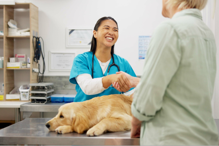
Kindness Animal Hospital is a family-run veterinary practice. Their website scattered service details across disconnected pages, offered no way to book online, and created roadblocks for prospective clients that competitors did not have. The site was creating a barrier to growth.
Thus I asked
How might we design a website that makes veterinary services easy to understand and appointments simple to book while preserving the warmth of a family-run practice?
The solution
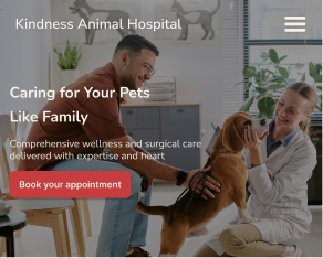
A clear path from "I need a vet" to "appointment requested" across every page and device
I restructured the site around a single conversion path, redesigned service content for scanning, and added 24/7 online booking.
discovery
A stakeholder interview revealed a site that hinders the user's ability to learn, decide, and book.
I conducted a one-hour interview with the practice manager to understand the business, the website's role, and day-to-day pain points. Three insights shaped everything that followed.
Insight 01
The front desk is the bottleneck
Most calls are routine — appointment requests, hours, directions. Without online booking, every interaction hits the front desk, overwhelming staff during business hours and losing after-hours demand entirely.
Insight 02
The website is invisible and outdated
Low search visibility and 10-year-old content means clients either can't find the site or don't trust it when they do. The practice's warmth and quality don't come through online.
Insight 03
There is no path from interest to action
No online appointment request. No clear CTAs. Service pages lack the digestible content that helps someone evaluate and commit. Visitors stall and leave.
information architecture
Clear structure that guides visitors from curiosity to care
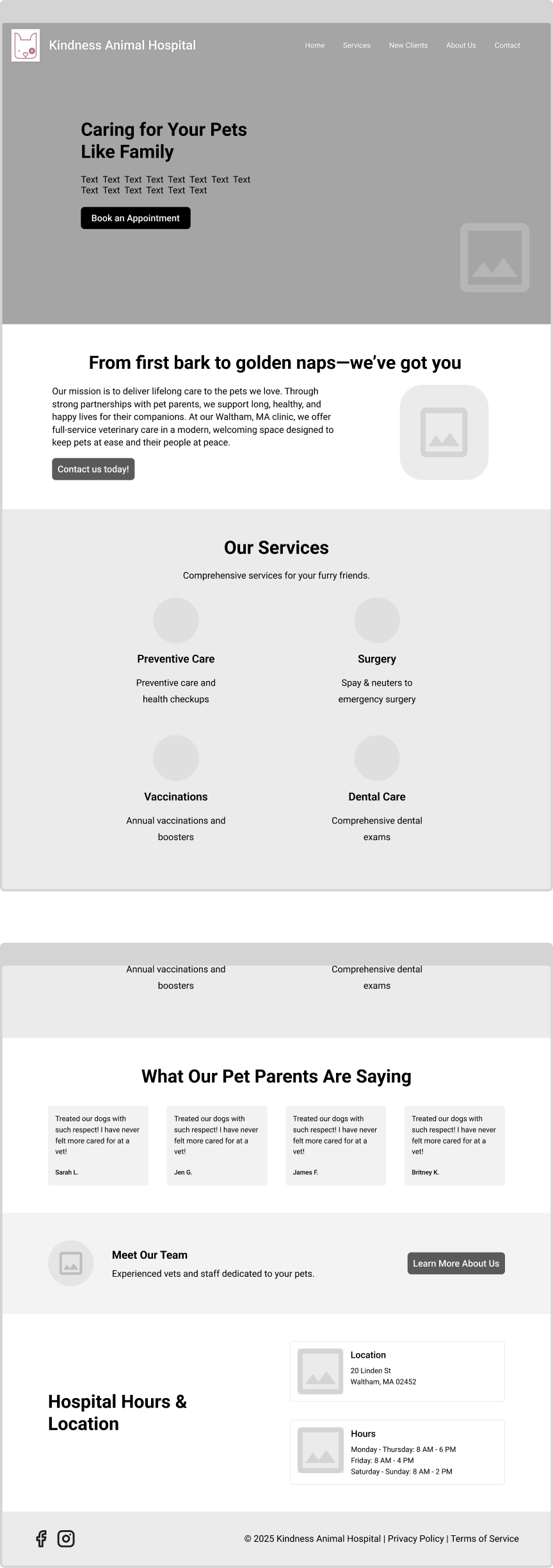
The existing site had no defined structure. Content was scattered and conversion paths didn't exist. I designed a site-wide IA that organizes content around what clients actually need: understanding services, evaluating the practice, and booking an appointment.
The architecture introduces four key elements: top-level service and clinic pages, scannable service detail pages, a dedicated New Clients hub, and an integrated appointment request form.


Wireframes
Testing structure before styling
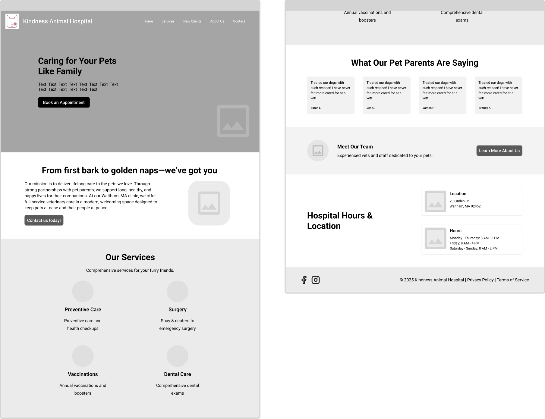
With the IA defined, I moved into low-fidelity wireframing to test different approaches to the three core pages: homepage, service pages, and the appointment flow. I explored multiple directions before converging on the final structure.
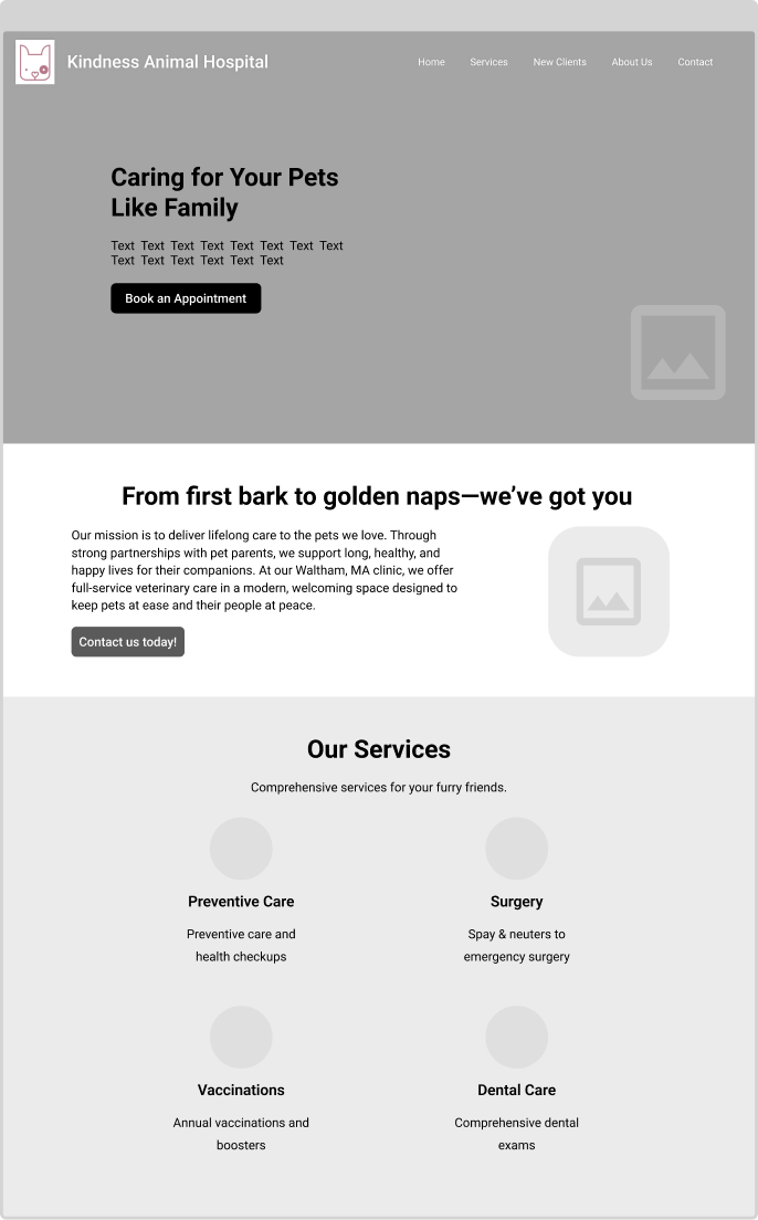

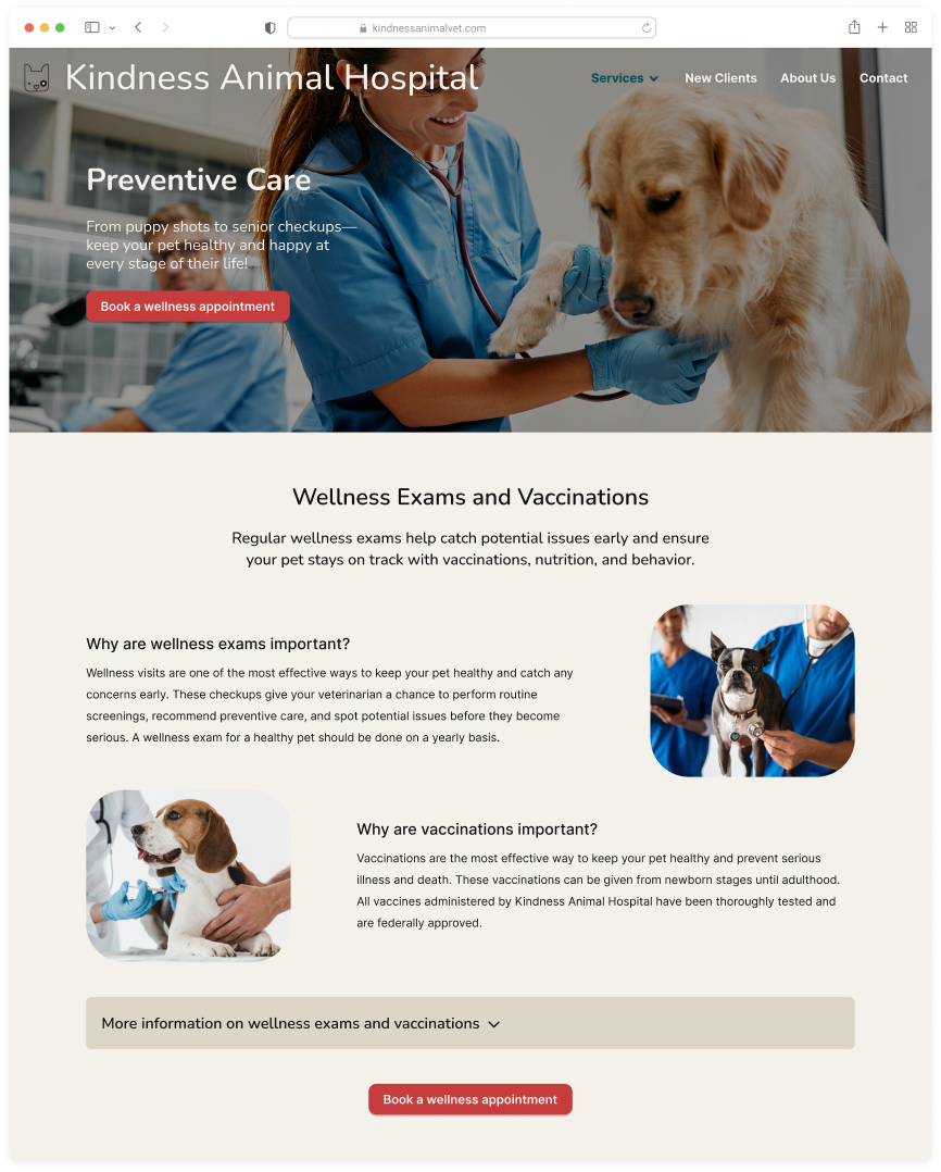
01
High-traffic services lead
Wellness exams and vaccinations drive the majority of appointments. The layout leads with those instead of treating all services equally, which matches actual client behavior.
02
Single conversion path
Every section funnels toward the appointment request. The CTA appears in the hero, inline with services, and at the page bottom so it’s always within reach, never buried.
03
Content builds trust, then asks
The scroll follows a natural decision sequence: what we offer, why families trust us, how to get started. The visitor builds confidence before they're asked to commit.
Key Design Decisions
4 design moves that shaped the outcome
Based on the stakeholder interview, a website audit, and competitive analysis, I iterated over 4 weeks. These four design decisions had the most impact.
01
Site-wide CTAs for appointment booking
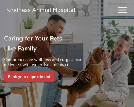
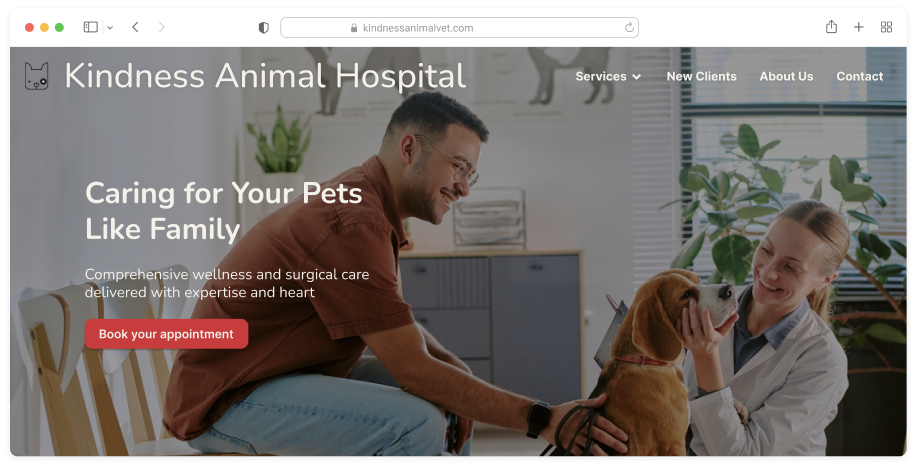
The original site had zero calls to action. I added a persistent booking CTA to the hero, above the fold on every page, and inline on service pages. One consistent button style, always within reach so booking never requires hunting.


02
An integrated appointment request form
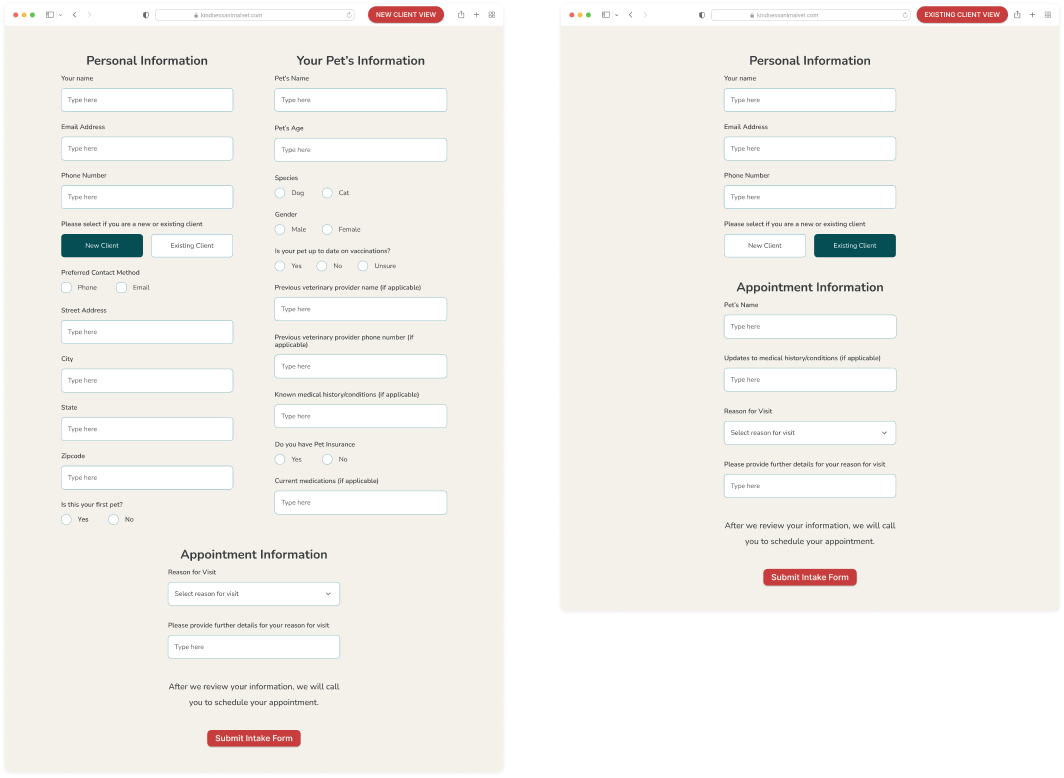
Booking used to require a phone call during business hours. The new form takes requests 24/7 and splits into two paths. New clients get onboarding fields and returning clients skip straight to scheduling. Staff get the info they need to triage without asking twice.


03
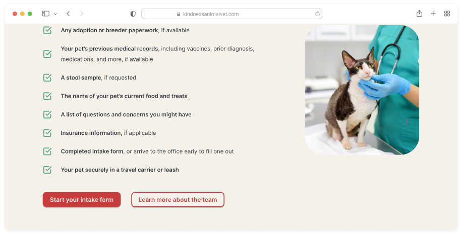
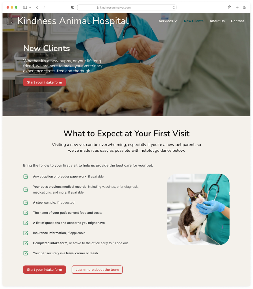
A dedicated New Clients hub
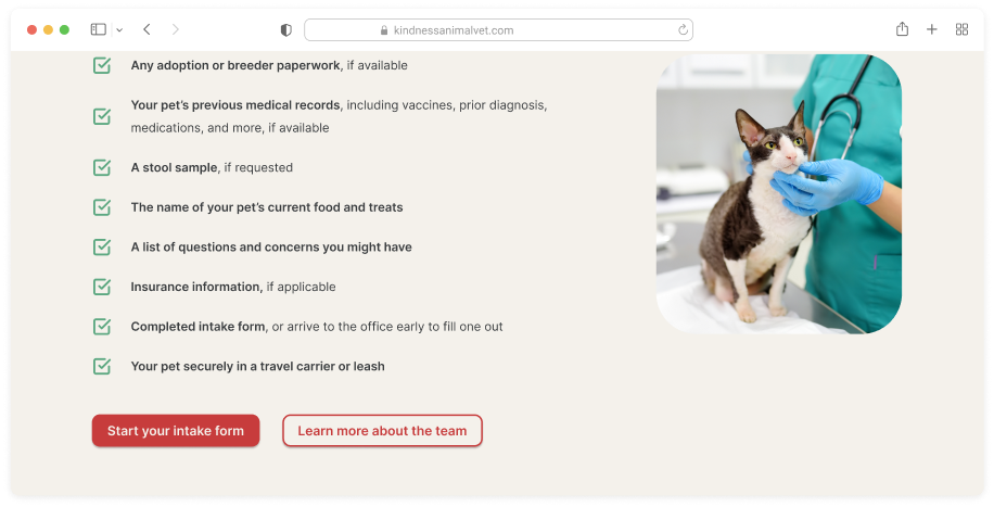
New clients had the most questions and the least guidance. This page puts a first-visit checklist, insurance info, and a scannable FAQ in one place so they show up prepared instead of calling the front desk.


04
Service pages redesigned for scanning and conversion
The old service pages were walls of text. Now each page leads with what clients actually want to know, breaks details into scannable sections, and ends with a single next step: book. No scrolling for a phone number.


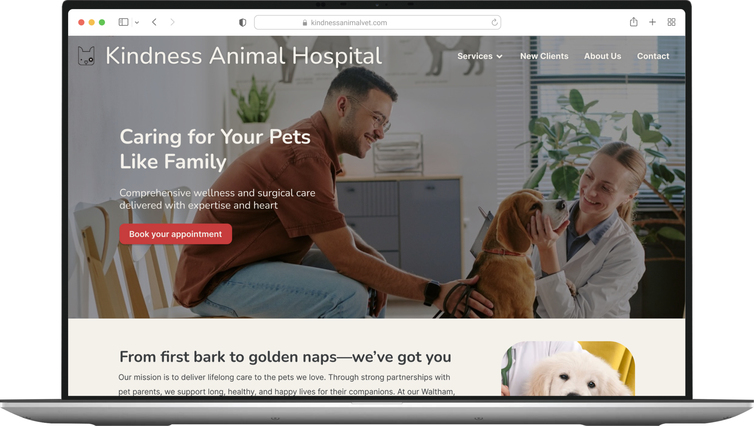
The Redesigned Experience
The redesigned experience across desktop and mobile
Best viewed on desktop. Explore the interactive redesigns and live Figma prototypes below:
Explore desktop mockups → Desktop
Explore mobile mockups → Mobile
Interact with live Figma → Desktop Prototype
Interact with live Figma→ Mobile Prototype
What I'd carry foward
What I'd carry foward
Dead ends are data, not failure
I explored many directions for the IA and homepage layout most were dead ends.
But realising why they failed clarified what the design actually needed: a single,
clear conversion path that mirrors how clients think, not how the clinic is organized.
The dead ends weren't waste; they were how I found the through-line.
Content is the experience, not decoration
Kindness's old site wasn't just poorly designed, it was poorly written. Breaking
dense copy into scannable sections, adding first-visit guidance, and writing clear
CTAs had as much impact as any layout change. I learned that restructuring content
is often the highest-leverage design decision you can make.
What I'd do differently
With more time, I would have conducted usability testing with actual clinic clients,
both new and returning, to validate whether the branching appointment form and
the New Clients hub actually reduce the front-desk bottleneck. The design is
research-informed, but it's not yet research-validated. That's the gap I'd close next.
© 2026 Chris Huitt
christopherhuitt@gmail.com
Case Study
Kindness Animal Hospital
Redesigning a veterinary clinic's website to turn scattered
information into a clear path from discovery to booking.


Timeline
April–June 2025 (11 weeks)
Role
Solo designer (UX research, IA, interaction design, UI)
Context
Graduate coursework — HCI Certificate
The Problem
Clients couldn't find what they needed or take action when they did
Kindness Animal Hospital is a family-run veterinary practice. Their website scattered service details across disconnected pages, offered no way to book online, and created roadblocks for prospective clients that competitors did not have. The site was creating a barrier to growth.
Thus I asked
How might we design a website that makes veterinary services easy to understand and appointments simple to book while preserving the warmth of a family-run practice?
The solution
A clear path from "I need a vet" to "appointment requested" across every page and device
I restructured the site around a single conversion path, redesigned service content for scanning, and added 24/7 online booking.
discovery
A stakeholder interview revealed a site that hinders the user's ability to learn, decide, and book.
I conducted a one-hour interview with the practice manager to understand the business, the website's role, and day-to-day pain points. Three insights shaped everything that followed.
Insight 01
The front desk is the bottleneck
Most calls are routine — appointment requests, hours, directions. Without online booking, every interaction hits the front desk, overwhelming staff during business hours and losing after-hours demand entirely.
Insight 02
The website is invisible and outdated
Low search visibility and 10-year-old content means clients either can't find the site or don't trust it when they do. The practice's warmth and quality don't come through online.
Insight 03
There is no path from interest to action
No online appointment request. No clear CTAs. Service pages lack the digestible content that helps someone evaluate and commit. Visitors stall and leave.
information architecture
Clear structure that guides visitors from curiosity to care
The existing site had no defined structure. Content was scattered and conversion paths didn't exist. I designed a site-wide IA that organizes content around what clients actually need: understanding services, evaluating the practice, and booking an appointment.
The architecture introduces four key elements: top-level service and clinic pages, scannable service detail pages, a dedicated New Clients hub, and an integrated appointment request form.

Wireframes
Testing structure before styling
With the IA defined, I moved into low-fidelity wireframing to test different approaches to the three core pages: homepage, service pages, and the appointment flow. I explored multiple directions before converging on the final structure.
01
High-traffic services lead
Wellness exams and vaccinations drive the majority of appointments. The layout leads with those instead of treating all services equally, which matches actual client behavior.
02
Single conversion path
Every section funnels toward the appointment request. The CTA appears in the hero, inline with services, and at the page bottom so it’s always within reach, never buried.
03
Content builds trust, then asks
The scroll follows a natural decision sequence: what we offer, why families trust us, how to get started. The visitor builds confidence before they're asked to commit.
Key Design Decisions
4 design moves that shaped the outcome
Based on the stakeholder interview, a website audit, and competitive analysis, I iterated over 4 weeks. These four design decisions had the most impact.
01
Site-wide CTAs for appointment booking
The original site had zero calls to action. I added a persistent booking CTA to the hero, above the fold on every page, and inline on service pages. One consistent button style, always within reach so booking never requires hunting.


02
An integrated appointment request form
Booking used to require a phone call during business hours. The new form takes requests 24/7 and splits into two paths. New clients get onboarding fields and returning clients skip straight to scheduling. Staff get the info they need to triage without asking twice.

03
A dedicated New Clients hub
New clients had the most questions and the least guidance. This page puts a first-visit checklist, insurance info, and a scannable FAQ in one place so they show up prepared instead of calling the front desk.

04
Service pages redesigned for scanning and conversion
The old service pages were walls of text. Now each page leads with what clients actually want to know, breaks details into scannable sections, and ends with a single next step: book. No scrolling for a phone number.
The Redesigned Experience
The redesigned experience across desktop and mobile
What I'd carry foward
What I'd carry foward
Dead ends are data, not failure
I explored many directions for the IA and homepage layout most were dead ends.
But realising why they failed clarified what the design actually needed: a single,
clear conversion path that mirrors how clients think, not how the clinic is organized.
The dead ends weren't waste; they were how I found the through-line.
Content is the experience, not decoration
Kindness's old site wasn't just poorly designed, it was poorly written. Breaking
dense copy into scannable sections, adding first-visit guidance, and writing clear
CTAs had as much impact as any layout change. I learned that restructuring content
is often the highest-leverage design decision you can make.
What I'd do differently
With more time, I would have conducted usability testing with actual clinic clients,
both new and returning, to validate whether the branching appointment form and
the New Clients hub actually reduce the front-desk bottleneck. The design is
research-informed, but it's not yet research-validated. That's the gap I'd close next.
© 2026 Chris Huitt
christopherhuitt@gmail.com
Case Study
Kindness Animal Hospital
Redesigning a veterinary clinic's website to turn scattered
information into a clear path from discovery to booking.


Timeline
April–June 2025 (11 weeks)
Role
Solo designer (UX research, IA, interaction design, UI)
Context
Graduate coursework — HCI Certificate
The Problem
Clients couldn't find what they needed or take action when they did
Kindness Animal Hospital is a family-run veterinary practice. Their website scattered service details across disconnected pages, offered no way to book online, and created roadblocks for prospective clients that competitors did not have. The site was creating a barrier to growth.
Thus I asked
How might we design a website that makes veterinary services easy to understand and appointments simple to book while preserving the warmth of a family-run practice?
The solution
A clear path from "I need a vet" to "appointment requested" across every page and device
I restructured the site around a single conversion path, redesigned service content for scanning, and added 24/7 online booking.
discovery
A stakeholder interview revealed a site that hinders the user's ability to learn, decide, and book.
I conducted a one-hour interview with the practice manager to understand the business, the website's role, and day-to-day pain points. Three insights shaped everything that followed.
Insight 01
The front desk is the bottleneck
Most calls are routine — appointment requests, hours, directions. Without online booking, every interaction hits the front desk, overwhelming staff during business hours and losing after-hours demand entirely.
Insight 02
The website is invisible and outdated
Low search visibility and 10-year-old content means clients either can't find the site or don't trust it when they do. The practice's warmth and quality don't come through online.
Insight 03
There is no path from interest to action
No online appointment request. No clear CTAs. Service pages lack the digestible content that helps someone evaluate and commit. Visitors stall and leave.
information architecture
Clear structure that guides visitors from curiosity to care
The existing site had no defined structure. Content was scattered and conversion paths didn't exist. I designed a site-wide IA that organizes content around what clients actually need: understanding services, evaluating the practice, and booking an appointment.
The architecture introduces four key elements: top-level service and clinic pages, scannable service detail pages, a dedicated New Clients hub, and an integrated appointment request form.

Wireframes
Testing structure before styling
With the IA defined, I moved into low-fidelity wireframing to test different approaches to the three core pages: homepage, service pages, and the appointment flow. I explored multiple directions before converging on the final structure.
01
High-traffic services lead
Wellness exams and vaccinations drive the majority of appointments. The layout leads with those instead of treating all services equally, which matches actual client behavior.
02
Single conversion path
Every section funnels toward the appointment request. The CTA appears in the hero, inline with services, and at the page bottom so it’s always within reach, never buried.
03
Content builds trust, then asks
The scroll follows a natural decision sequence: what we offer, why families trust us, how to get started. The visitor builds confidence before they're asked to commit.
Key Design Decisions
4 design moves that shaped the outcome
Based on the stakeholder interview, a website audit, and competitive analysis, I iterated over 4 weeks. These four design decisions had the most impact.
01
Site-wide CTAs for appointment booking
The original site had zero calls to action. I added a persistent booking CTA to the hero, above the fold on every page, and inline on service pages. One consistent button style, always within reach so booking never requires hunting.


02
An integrated appointment request form
Booking used to require a phone call during business hours. The new form takes requests 24/7 and splits into two paths. New clients get onboarding fields and returning clients skip straight to scheduling. Staff get the info they need to triage without asking twice.
03
A dedicated New Clients hub
New clients had the most questions and the least guidance. This page puts a first-visit checklist, insurance info, and a scannable FAQ in one place so they show up prepared instead of calling the front desk.

04
Service pages redesigned for scanning and conversion
The old service pages were walls of text. Now each page leads with what clients actually want to know, breaks details into scannable sections, and ends with a single next step: book. No scrolling for a phone number.
The Redesigned Experience
The redesigned experience across desktop and mobile
What I'd carry foward
What I'd carry foward
Dead ends are data, not failure
I explored many directions for the IA and homepage layout most were dead ends.
But realizing why they failed clarified what the design actually needed: a single,
clear conversion path that mirrors how clients think, not how the clinic is organized.
The dead ends weren't waste; they were how I found the through-line.
Content is the experience, not decoration
Kindness's old site wasn't just poorly designed, it was poorly written. Breaking
dense copy into scannable sections, adding first-visit guidance, and writing clear
CTAs had as much impact as any layout change. I learned that restructuring content
is often the highest-leverage design decision you can make.
What I'd do differently
With more time, I would have conducted usability testing with actual clinic clients,
both new and returning, to validate whether the branching appointment form and
the New Clients hub actually reduce the front-desk bottleneck. The design is
research-informed, but it's not yet research-validated. That's the gap I'd close next.
© 2026 Chris Huitt
christopherhuitt@gmail.com