CHRIS HUITT
Case Study
British Airways Mobile App
Redesigning a flagship airline's mobile app to inspire travel, streamline booking, and bring trip management back where it belongs - inside the app.


Timeline
Sept–Dec 2025 (11 weeks)
Role
Solo designer (UX research, IA, interaction design, UI)
Context
Graduate coursework — HCI Certificate
The Problem
BA became a premium airline experience that stopped at the terminal
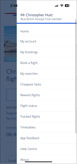
British Airways' mobile app experience fell short of the prestigious, historic brand. The homepage offered no inspiration, no clear path to key information pages, and minimal conversion points. Navigation buried essential features behind a hamburger menu with over a dozen flat options. When a traveler needed to manage their trip, change a seat, add baggage, or view flight details — the app pushed them out to a mobile browser, breaking trust at exactly the wrong moment.
Thus I asked
How might we redesign the British Airways app to inspire travelers to book, build confidence through an in-app trip management experience, and make core tasks effortless?
The solution
Integrated booking in-app, added trip management, and built a home screen that finally does its job
I replaced the browser-based flow with a native end-to-end experience, built on BA's own brand system.
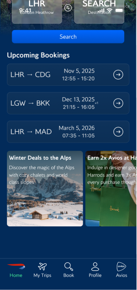
Home
Before

After
Flight info
Before

After
discovery
Every path through the app ended at a browser window
I ran a heuristic evaluation across the full traveler journey: opening the app, searching, booking, and managing trips. As a recent BA user myself, I already felt where the friction was. The evaluation confirmed it.
I also built a journey map for James Stanton — a 30-year-old consultant who flies for work weekly and depends on the app from booking through landing. Mapping his experience across five stages showed exactly where the app lacked in good usability and where the opportunity was.
User Journey Map
Business traveller · London → Tokyo
Sentiment dips hardest at Post-Security — delay info arrives too late.
High
Mid
Low
Booking
Calm · 4 wks out
Check-in
Stressed · Heathrow
Post-Security
Worried · At the gate
In-Flight
Neutral · 12h in air
Landed
Focused · Haneda

Stage
"Looking forward to the new Club World suite."

Pain
Clunky flow; loyalty doesn't auto-fill.

Opportunity
Pre-fill passport & loyalty data.

Stage
"Do I have time for the lounge?"

Pain
Seat editing clunky; no wallet pass.

Opportunity
Smart wallet + inline seat swap.

Stage
"Are there other flights tonight?"

Pain
App notifies delay after the board.

Opportunity
Proactive alerts + 1-tap rebook.

Stage
"Are there better WiFi options?"

Pain
Browser WiFi fragile; info buried.

Opportunity
In-app WiFi + persistent dashboard.

Stage
"What carousel? How do I get in?"

Pain
Baggage & transport info hidden.

Opportunity
'Just landed' auto-screen.


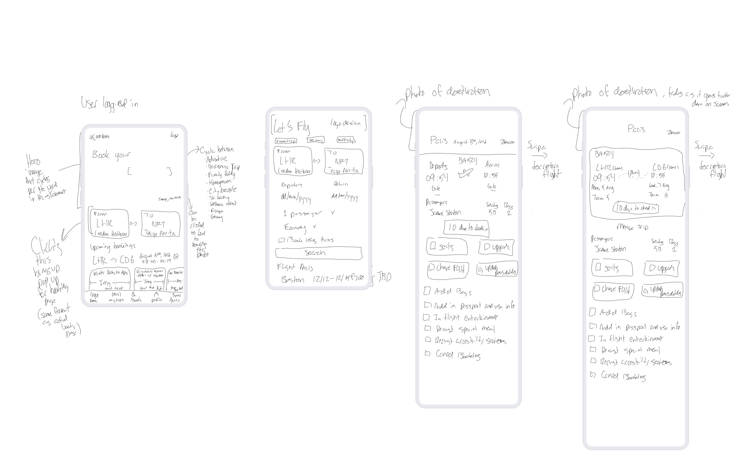
sketches to hi-fi
Testing BA’s information hierarchy in black and white
I sketched directions for a homepage worth opening, then built out the screens BA never had: a full booking flow and trip management. From there, I moved into v1 high-fidelity mockups in Figma using BA's exact Pantone colors and typeface, so the redesign read as an evolution of the brand, not a reskin.
Home
Cycling hero & quick booking
booking
Action led entry point
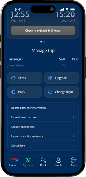
trip info
In-app trip management
01
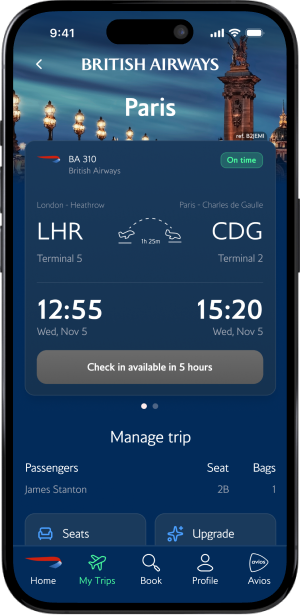
Destination photo fades into the BA brand color as the user scrolls.
02
Type hierarchy on the flight card leads with time → date → airport.
03
Swipe left on the card to reveal return flight details.
04
All trip-management features live in-app instead of bouncing to the browser.
01
Hero image cycles and matches the word in the hero statement: Adventure, Business Trip, Family Getaway, Honeymoon, etc. By clicking the image, you can book that destination.
02
Quick-booking shortcut: pick airports inline. Mirrors the main booking page for familiarity.
03
Avios-linked promos and deals to reward repeat use.
01
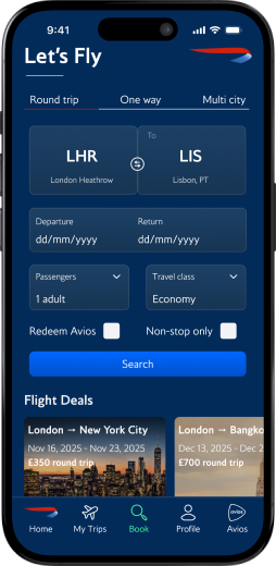
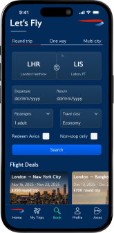
"Let's Fly" keeps the action-led copy theme, initiating the user into the flow.
02
Booking layout mirrors the home page to carry familiarity through the journey.
usability testing
Two users, one task, and the changes I didn't expect to make
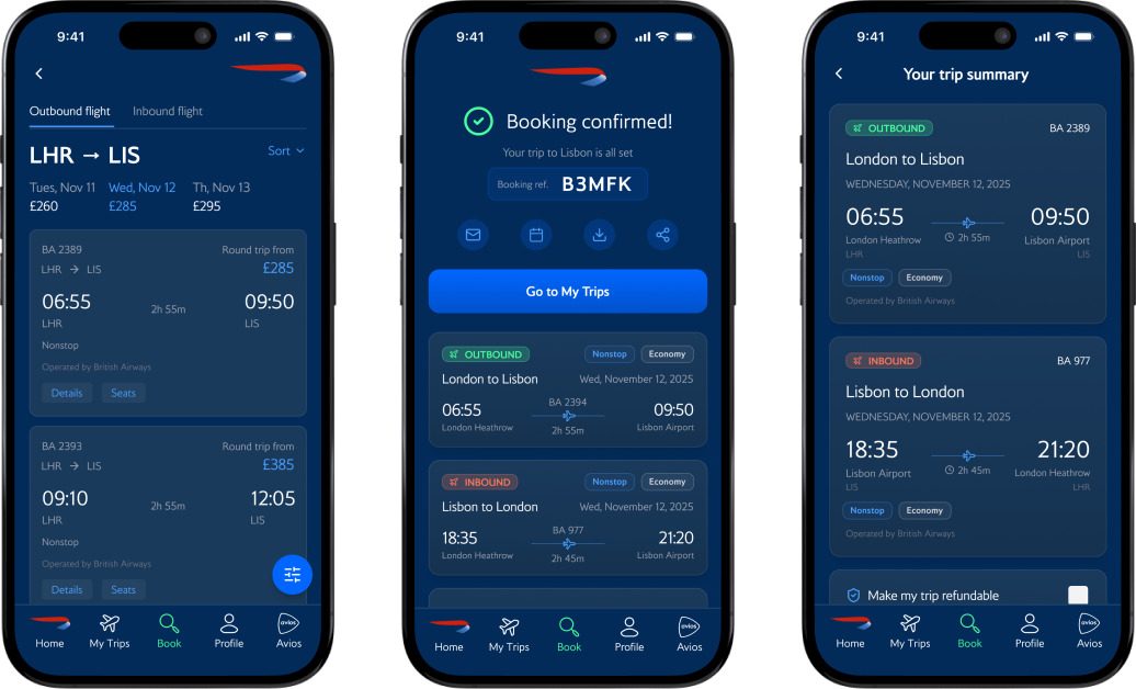
I ran a task-based usability study with two participants: book a round-trip flight from London to Lisbon for a same-day business meeting. To benchmark the redesign, participants completed the same task on my BA prototype and on the Virgin Atlantic app. I synthesised the findings using a KJ affinity analysis, grouping observations into four themes.


THEME 01 - 3 VOTES
Inbound/Outbound confusion
Both legs used the same green color for buttons and labels. Users couldn't tell which flight they were selecting. One user noted it could lead to booking the wrong fare.
THEME 02 - 2 VOTES
Clarity - pages are too busy
The first user missed the quick-book feature entirely and navigated through the bottom tab instead. The second found it but felt the page was hectic. Ambition had outpaced usability.
THEME 03
Missing features
Users expected a calendar date picker, luggage info per ticket tier, and confirmation details on the booking reference. These were items planned for the final iteration.
THEME 04
Save for later - highly requested feature
Both users independently asked for the ability to save a flight search and return to it later.
Key Design Decisions
Five calls that defined the redesign
Every decision here came from somewhere: the heuristic evaluation, the user journey, sketching, or usability testing. These five had the most impact.
01
Site-wide CTAs for appointment booking
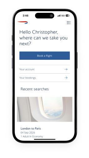
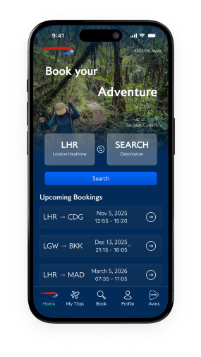
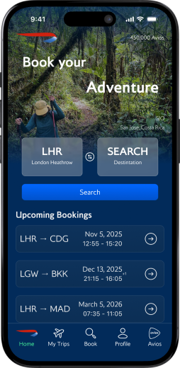
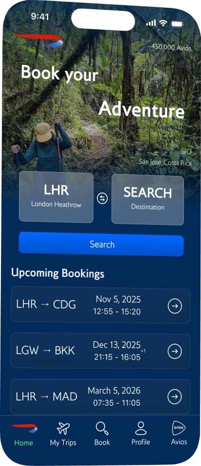
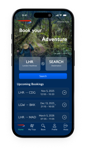
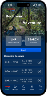
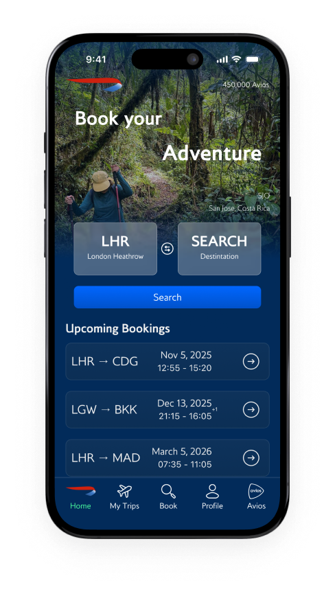
The old homepage was a dead end. The redesign opens with a cycling hero that rotates through travel contexts, making users picture their next trip before they've touched a form field. Scroll down and every element earns its place: search to book now, upcoming trips to re-engage, Avios balance to remind users what they can spend, and curated deals that turn a casual scroll into a conversion.
02
An integrated appointment request form
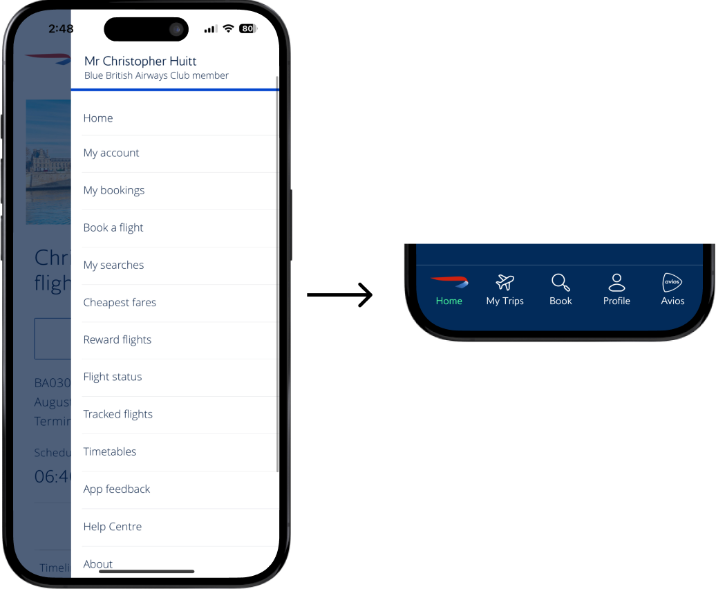
The original app buried 12 options inside a hamburger menu. I replaced it with a five-tab bar built around the tasks users actually perform: Home, My Trips, Book, Profile, and Avios. Always visible, always within thumb reach


03
A dedicated New Clients hub
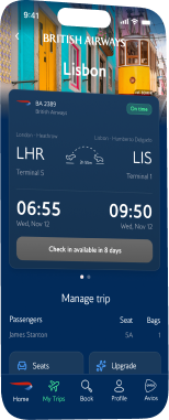
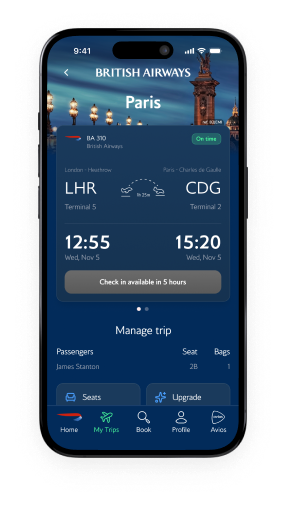
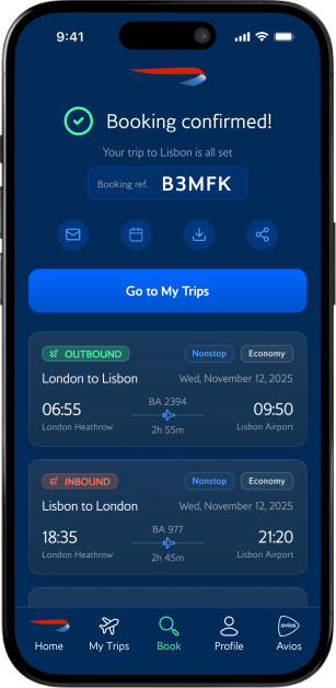
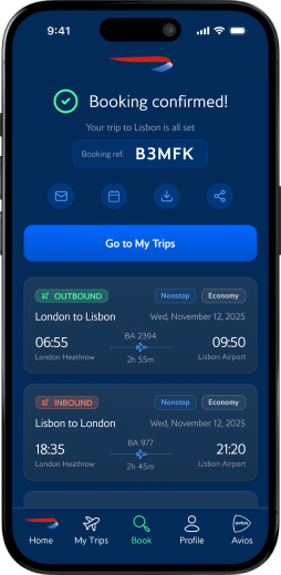
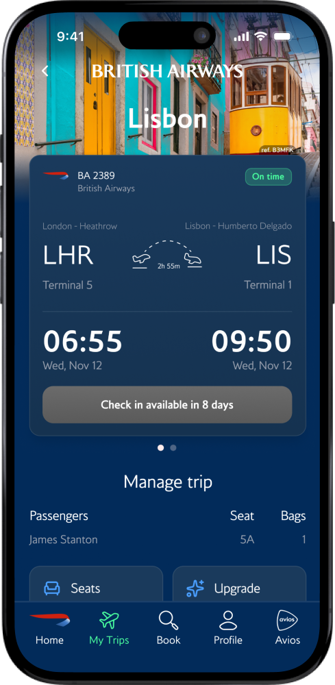
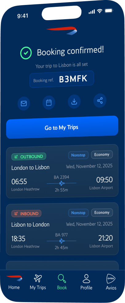
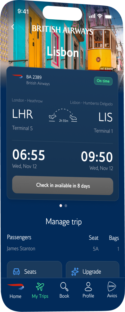
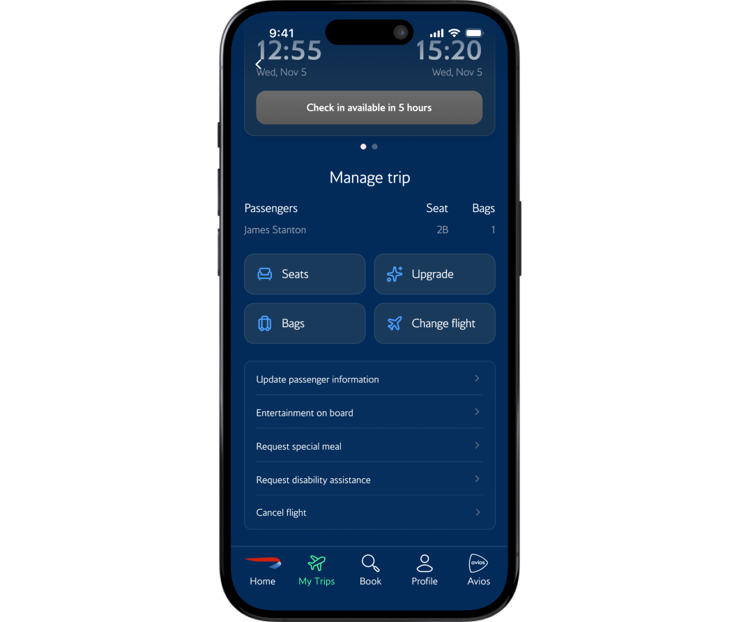
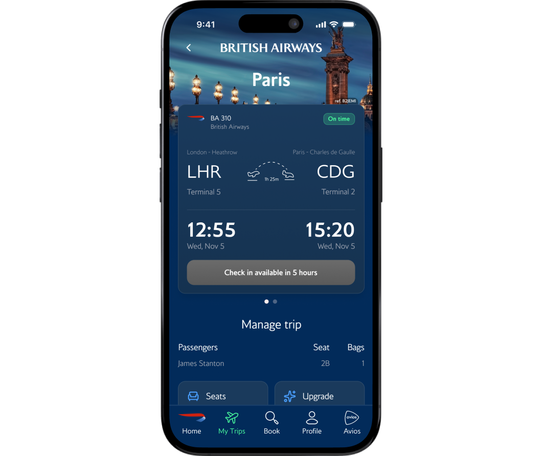
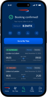
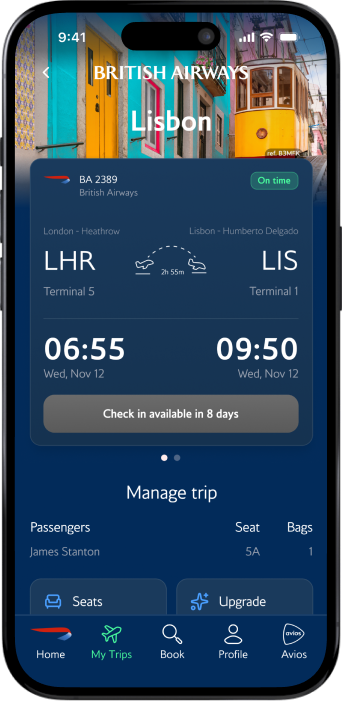
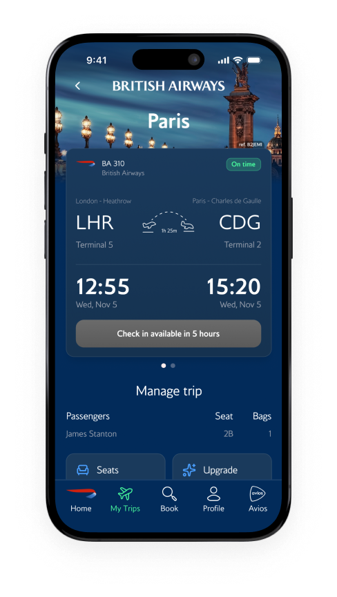
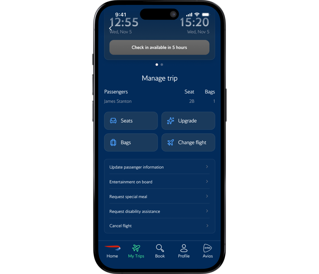
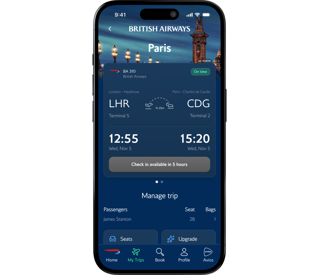
Tapping 'Manage My Booking' used to open Safari, breaking context and trust. The redesign replaces that with a native Trip Detail page: flight status, check-in countdown, passenger details, and actions for seats, bags, and changes, all with clear hierarchy and nothing leaving the app.
04
Clear typographic hierarchy for the most time sensitive moments
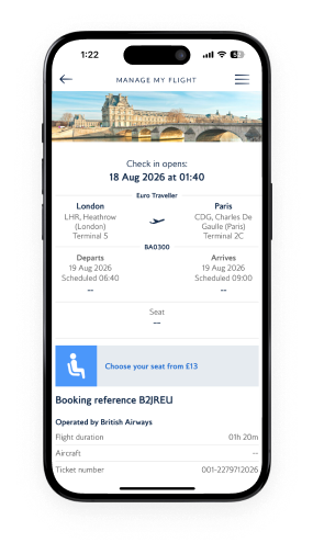
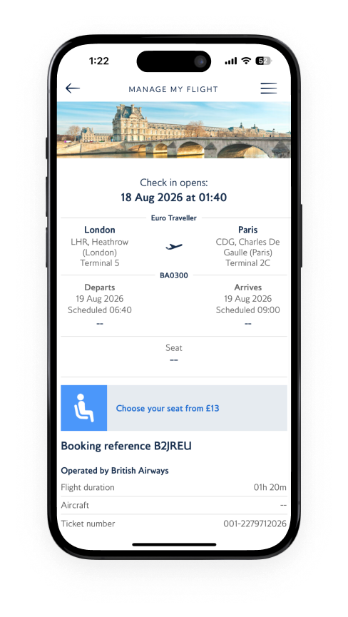
The original flight detail screen treated everything equally: times, terminals, booking references, ticket numbers all at the same size. I built a deliberate hierarchy where departure and arrival times dominate, airport codes, gates, and terminals sit just below, and secondary details stay smaller and lower. A user rushing to their gate can glance and know exactly when and where in two seconds.
03
In-app trip management that never breaks context
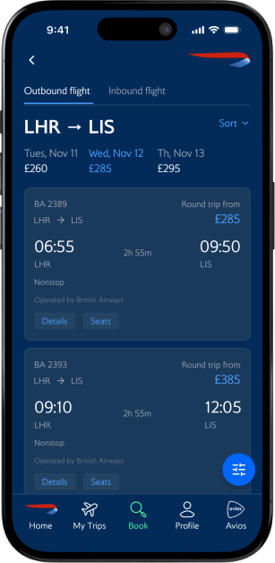
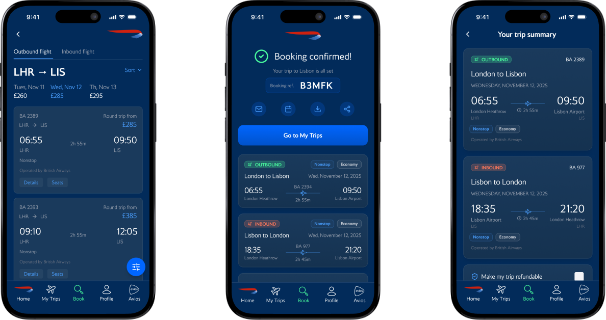
There was no native booking flow. I designed seven screens from search to confirmation, each built to reduce uncertainty: colour-coded outbound/inbound tags, a persistent running total, and a transparent price breakdown. The user always knows where they are and what comes next.

The Redesigned Experience
One cohesive experience, from inspiration to confirmation
booking flow
Home

Search
Flights
Summary
Passengers
Payment

Confirmed
trip management flow
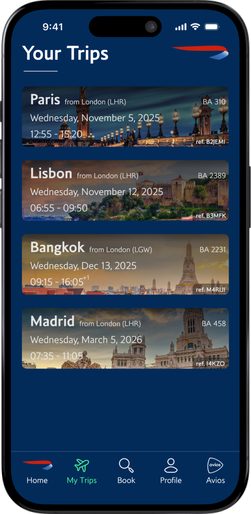
Your Trips
Trip Detail
What I'd carry foward
What I'd carry foward
Dead ends are data, not failure
I explored many directions for the IA and homepage layout most were dead ends.
But realising why they failed clarified what the design actually needed: a single,
clear conversion path that mirrors how clients think, not how the clinic is organized.
The dead ends weren't waste; they were how I found the through-line.
Benchmarking agaisnt a competitor changed how I designed
Running the same task on my prototype and the Virgin Atlantic app gave me a reference point I wouldn't have had otherwise. It showed me where my designs held up and where they fell short, like the inbound/outbound confusion that Virgin handled more clearly. Comparative testing forced me to defend every decision against a real, shipped product.
What a second round of testing would’ve provided
With more time, I would have conducted usability testing with actual clinic clients,
both new and returning, to validate whether the branching appointment form and
the New Clients hub actually reduce the front-desk bottleneck. The design is
research-informed, but it's not yet research-validated. That's the gap I'd close next.
© 2026 Chris Huitt
christopherhuitt@gmail.com
Case Study
British Airways Mobile App
Redesigning a flagship airline's mobile app to inspire travel, streamline booking, and bring trip management back where it belongs - inside the app.
Timeline
Sept–Dec 2025 (11 weeks)
Role
Solo designer (UX research, IA, interaction design, UI)
Context
Graduate coursework — HCI Certificate
The Problem
BA became a premium airline experience that stopped at the terminal
British Airways' mobile app experience fell short of the prestigious, historic brand. The homepage offered no inspiration, no clear path to key information pages, and minimal conversion points. Navigation buried essential features behind a hamburger menu with over a dozen flat options. When a traveler needed to manage their trip, change a seat, add baggage, or view flight details — the app pushed them out to a mobile browser, breaking trust at exactly the wrong moment.
Thus I asked
How might we redesign the British Airways app to inspire travelers to book, build confidence through an in-app trip management experience, and make core tasks effortless?
The solution
Integrated booking in-app, added trip management, and built a home screen that finally does its job
I replaced the browser-based flow with a native end-to-end experience, built on BA's own brand system.
Home
Before

After
Flight info
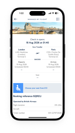
Before

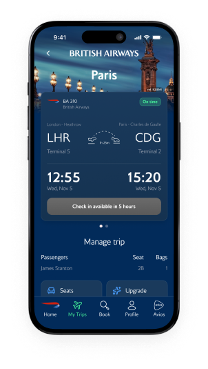
After
discovery
Every path through the app ended at a browser window
I ran a heuristic evaluation across the full traveler journey: opening the app, searching, booking, and managing trips. As a recent BA user myself, I already felt where the friction was. The evaluation confirmed it.
I also built a journey map for James Stanton — a 30-year-old consultant who flies for work weekly and depends on the app from booking through landing. Mapping his experience across five stages showed exactly where the app lacked in good usability and where the opportunity was.
User Journey Map
Business traveller · London → Tokyo
Sentiment dips hardest at Post-Security — delay info arrives too late.
High
Mid
Low
Booking
Calm · 4 wks out
Check-in
Stressed · Heathrow
Post-Security
Worried · At the gate
In-Flight
Neutral · 12h in air
Landed
Focused · Haneda

Stage
"Looking forward to the new Club World suite."

Pain
Clunky flow; loyalty doesn't auto-fill.

Opportunity
Pre-fill passport & loyalty data.

Stage
"Do I have time for the lounge?"

Pain
Seat editing clunky; no wallet pass.

Opportunity
Smart wallet + inline seat swap.

Stage
"Are there other flights tonight?"

Pain
App notifies delay after the board.

Opportunity
Proactive alerts + 1-tap rebook.

Stage
"Are there better WiFi options?"

Pain
Browser WiFi fragile; info buried.

Opportunity
In-app WiFi + persistent dashboard.

Stage
"What carousel? How do I get in?"

Pain
Baggage & transport info hidden.

Opportunity
'Just landed' auto-screen.


sketches to hi-fi
Testing BA’s information hierarchy in black and white
I sketched directions for a homepage worth opening, then built out the screens BA never had: a full booking flow and trip management. From there, I moved into v1 high-fidelity mockups in Figma using BA's exact Pantone colors and typeface, so the redesign read as an evolution of the brand, not a reskin.
Home
Cycling hero & quick booking
booking
Action led entry point
trip info
In-app trip management
01
Hero image cycles and matches the word in the hero statement: Adventure, Business Trip, Family Getaway, Honeymoon, etc. By clicking the image, you can book that destination.
02
Quick-booking shortcut: pick airports inline. Mirrors the main booking page for familiarity.
03
Avios-linked promos and deals to reward repeat use.
01
"Let's Fly" keeps the action-led copy theme, initiating the user into the flow.
02
Booking layout mirrors the home page to carry familiarity through the journey.
01
Destination photo fades into the BA brand color as the user scrolls.
02
Type hierarchy on the flight card leads with time → date → airport.
03
Swipe left on the card to reveal return flight details.
04
All trip-management features live in-app instead of bouncing to the browser.
usability testing
Two users, one task, and the changes I didn't expect to make
I ran a task-based usability study with two participants: book a round-trip flight from London to Lisbon for a same-day business meeting. To benchmark the redesign, participants completed the same task on my BA prototype and on the Virgin Atlantic app. I synthesised the findings using a KJ affinity analysis, grouping observations into four themes.


THEME 01 - 3 VOTES
Inbound/Outbound confusion
Both legs used the same green color for buttons and labels. Users couldn't tell which flight they were selecting. One user noted it could lead to booking the wrong fare.
THEME 02 - 2 VOTES
Clarity - pages are too busy
The first user missed the quick-book feature entirely and navigated through the bottom tab instead. The second found it but felt the page was hectic. Ambition had outpaced usability.
THEME 03
Missing features
Users expected a calendar date picker, luggage info per ticket tier, and confirmation details on the booking reference. These were items planned for the final iteration.
THEME 04
Save for later - highly requested feature
Both users independently asked for the ability to save a flight search and return to it later.
Key Design Decisions
Five calls that defined the redesign
Every decision here came from somewhere: the heuristic evaluation, the user journey, sketching, or usability testing. These five had the most impact.
01
Site-wide CTAs for appointment booking
The old homepage was a dead end. The redesign opens with a cycling hero that rotates through travel contexts, making users picture their next trip before they've touched a form field. Scroll down and every element earns its place: search to book now, upcoming trips to re-engage, Avios balance to remind users what they can spend, and curated deals that turn a casual scroll into a conversion.
02
An integrated appointment request form
The original app buried 12 options inside a hamburger menu. I replaced it with a five-tab bar built around the tasks users actually perform: Home, My Trips, Book, Profile, and Avios. Always visible, always within thumb reach
03
A dedicated New Clients hub
Tapping 'Manage My Booking' used to open Safari, breaking context and trust. The redesign replaces that with a native Trip Detail page: flight status, check-in countdown, passenger details, and actions for seats, bags, and changes, all with clear hierarchy and nothing leaving the app.
04
Clear typographic hierarchy for the most time sensitive moments
The original flight detail screen treated everything equally: times, terminals, booking references, ticket numbers all at the same size. I built a deliberate hierarchy where departure and arrival times dominate, airport codes, gates, and terminals sit just below, and secondary details stay smaller and lower. A user rushing to their gate can glance and know exactly when and where in two seconds.
03
In-app trip management that never breaks context
There was no native booking flow. I designed seven screens from search to confirmation, each built to reduce uncertainty: colour-coded outbound/inbound tags, a persistent running total, and a transparent price breakdown. The user always knows where they are and what comes next.
The Redesigned Experience
One cohesive experience, from inspiration to confirmation
booking flow
Home

Search

Flights

Summary

Passengers

Payment

Confirmed
trip management flow
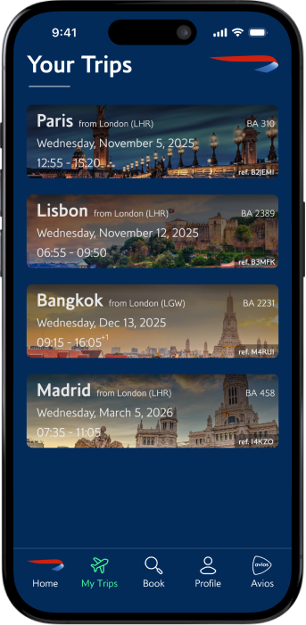
Your Trips
Trip Detail
What I'd carry foward
What I'd carry foward
Dead ends are data, not failure
I explored many directions for the IA and homepage layout most were dead ends.
But realising why they failed clarified what the design actually needed: a single,
clear conversion path that mirrors how clients think, not how the clinic is organized.
The dead ends weren't waste; they were how I found the through-line.
Benchmarking agaisnt a competitor changed how I designed
Running the same task on my prototype and the Virgin Atlantic app gave me a reference point I wouldn't have had otherwise. It showed me where my designs held up and where they fell short, like the inbound/outbound confusion that Virgin handled more clearly. Comparative testing forced me to defend every decision against a real, shipped product.
What a second round of testing would’ve provided
With more time, I would have conducted usability testing with actual clinic clients,
both new and returning, to validate whether the branching appointment form and
the New Clients hub actually reduce the front-desk bottleneck. The design is
research-informed, but it's not yet research-validated. That's the gap I'd close next.
© 2026 Chris Huitt
christopherhuitt@gmail.com
Case Study
British Airways Mobile App
Redesigning a flagship airline's mobile app to inspire travel, streamline booking, and bring trip management back where it belongs - inside the app.
Timeline
Sept–Dec 2025 (11 weeks)
Role
Solo designer (UX research, IA, interaction design, UI)
Context
Graduate coursework — HCI Certificate
The Problem
BA became a premium airline experience that stopped at the terminal
British Airways' mobile app experience fell short of the prestigious, historic brand. The homepage offered no inspiration, no clear path to key information pages, and minimal conversion points. Navigation buried essential features behind a hamburger menu with over a dozen flat options. When a traveler needed to manage their trip, change a seat, add baggage, or view flight details — the app pushed them out to a mobile browser, breaking trust at exactly the wrong moment.
Thus I asked
How might we redesign the British Airways app to inspire travelers to book, build confidence through an in-app trip management experience, and make core tasks effortless?
The solution
Integrated booking in-app, added trip management, and built a home screen that finally does its job
I replaced the browser-based flow with a native end-to-end experience, built on BA's own brand system.
Home
Before

After
Flight info
Before
After
discovery
Every path through the app ended at a browser window
I ran a heuristic evaluation across the full traveler journey: opening the app, searching, booking, and managing trips. As a recent BA user myself, I already felt where the friction was. The evaluation confirmed it.
I also built a journey map for James Stanton — a 30-year-old consultant who flies for work weekly and depends on the app from booking through landing. Mapping his experience across five stages showed exactly where the app lacked in good usability and where the opportunity was.
User Journey Map
Business traveller · London → Tokyo
Sentiment dips hardest at Post-Security — delay info arrives too late.
High
Mid
Low
Booking
Calm · 4 wks out
Check-in
Stressed · Heathrow
Post-Security
Worried · At the gate
In-Flight
Neutral · 12h in air
Landed
Focused · Haneda

Stage
"Looking forward to the new Club World suite."

Pain
Clunky flow; loyalty doesn't auto-fill.

Opportunity
Pre-fill passport & loyalty data.

Stage
"Do I have time for the lounge?"

Pain
Seat editing clunky; no wallet pass.

Opportunity
Smart wallet + inline seat swap.

Stage
"Are there other flights tonight?"

Pain
App notifies delay after the board.

Opportunity
Proactive alerts + 1-tap rebook.

Stage
"Are there better WiFi options?"

Pain
Browser WiFi fragile; info buried.

Opportunity
In-app WiFi + persistent dashboard.

Stage
"What carousel? How do I get in?"

Pain
Baggage & transport info hidden.

Opportunity
'Just landed' auto-screen.


sketches & WIREFRAMES
Testing BA’s information hierarchy in black and white
I sketched directions for a homepage worth opening, then built out the screens BA never had: a full booking flow and trip management. From there, I moved into v1 high-fidelity mockups in Figma using BA's exact Pantone colors and typeface, so the redesign read as an evolution of the brand, not a reskin.
Home
Cycling hero & quick booking
booking
Action led entry point
trip info
In-app trip management
01
Hero image cycles and matches the word in the hero statement: Adventure, Business Trip, Family Getaway, Honeymoon, etc. By clicking the image, you can book that destination.
02
Quick-booking shortcut: pick airports inline. Mirrors the main booking page for familiarity.
03
Avios-linked promos and deals to reward repeat use.
01
"Let's Fly" keeps the action-led copy theme, initiating the user into the flow.
02
Booking layout mirrors the home page to carry familiarity through the journey.
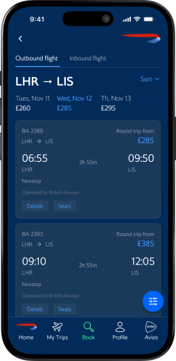
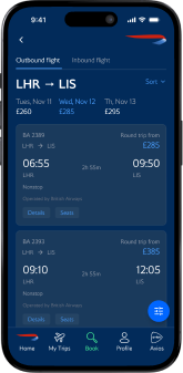
01
Destination photo fades into the BA brand color as the user scrolls.
02
Type hierarchy on the flight card leads with time → date → airport.
03
Swipe left on the card to reveal return flight details.
04
All trip-management features live in-app instead of bouncing to the browser.
usability testing
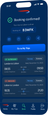
A same-day London to Lisbon booking exposed four design flaws
I ran a task-based usability study with two participants: book a round-trip flight from London to Lisbon for a same-day business meeting. To benchmark the redesign, participants completed the same task on my BA prototype and on the Virgin Atlantic app. I synthesized the findings using a KJ affinity analysis, grouping observations into four themes.


THEME 01 - 3 VOTES
Inbound/Outbound confusion
Both legs used the same green color for buttons and labels. Users couldn't tell which flight they were selecting. One user noted it could lead to booking the wrong fare.
THEME 02 - 2 VOTES
Clarity - pages are too busy
The first user missed the quick-book feature entirely and navigated through the bottom tab instead. The second found it but felt the page was hectic. Ambition had outpaced usability.
THEME 03
Missing features
Users expected a calendar date picker, luggage info per ticket tier, and confirmation details on the booking reference. These were items planned for the final iteration.
THEME 04
Save for later - highly requested feature
Both users independently asked for the ability to save a flight search and return to it later.
Key Design Decisions
Five calls that defined the redesign
Every decision here came from somewhere: the heuristic evaluation, the user journey, sketching, or usability testing. These five had the most impact.
01
A homepage that makes you want to book your next trip and lets you book it on the spot
The old homepage was a dead end. The redesign opens with a cycling hero that rotates through travel contexts, making users picture their next trip before they've touched a form field. Scroll down and every element earns its place: search to book now, upcoming trips to re-engage, Avios balance to remind users what they can spend, and curated deals that turn a casual scroll into a conversion.

02
Persistent navigation built around the items users need at home and at the gate
The original app buried 12 options inside a hamburger menu. I replaced it with a five-tab bar built around the tasks users actually perform: Home, My Trips, Book, Profile, and Avios. Always visible, always within thumb reach
03
In-app trip management that never breaks context
Tapping 'Manage My Booking' used to open the phone’s default browser, breaking context and eroding trust. The redesign brings everything into a native Trip Detail page with clear typographic hierarchy: flight status and check-in countdown are immediately scannable, while secondary actions like seats changes are grouped by priority. No browser, no friction, no lost context.
04
Clear typographic hierarchy for the most time sensitive moments
The original flight detail screen treated everything equally: times, terminals, booking references, ticket numbers all at the same size. I built a deliberate hierarchy where departure and arrival times dominate, airport codes, gates, and terminals sit just below, and secondary details stay smaller and lower. A user rushing to their gate can glance and know exactly when and where in two seconds.
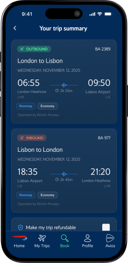
05
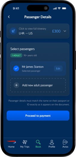
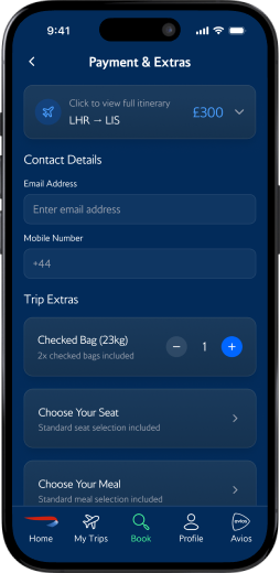
A complete booking flow designed for confidence
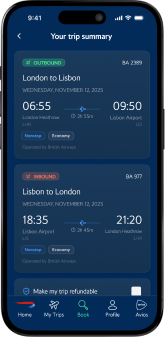
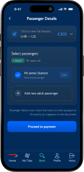
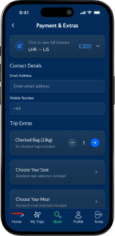
There was no native booking flow. I designed seven screens from search to confirmation, each built to reduce uncertainty: colour-coded outbound/inbound tags, a persistent running total, and a transparent price breakdown. The user always knows where they are and what comes next.
The Redesigned Experience
One cohesive experience, from inspiration to confirmation
booking flow
Home
Search
Flights
Summary
Passengers
Payment
Confirmed
trip management flow
Your Trips
Trip Detail
What I'd carry foward
What I'd carry foward
Test earlier, simplify sooner
My first iteration of the homepage tried to do too much. Inspiration, booking, upcoming trips, deals, and promotions were all competing for attention. Usability testing caught that the quick-book feature I was most proud of was completely missed by the two of the three participants. I learned that ambition in a redesign needs to be tempered by real user behavior. The strongest version of a screen is often the one where you've removed the most, not added the most.
Benchmarking against a competitor changed how I designed
Running the same task on my prototype and the Virgin Atlantic app gave me a reference point I wouldn't have had otherwise. It showed me where my designs held up and where they fell short, like the inbound/outbound confusion that Virgin handled more clearly. Comparative testing forced me to defend every decision against a real, shipped product.
What a second round of testing would’ve provided
With more time, I would have run a second round of usability testing on the refined designs to validate that the homepage simplification actually resolved the confusion, and measuring task completion time against the original app. The redesign is research-informed and test-iterated, but closing that loop with a second study would have made the findings conclusive rather than directional.
© 2026 Chris Huitt
christopherhuitt@gmail.com